Showing posts with label abstraction. Show all posts

Wednesday, 29 September 2021

Eamon Colman "Into the Mountain"

 A week ago I trekked (via car) to Thurles in Tipperary to The Source Arts Centre in order to see Eamon Colman's exhibition of recent work, Into the Mountain. The Source is nicely situated in the middle of town next to the river. I don't know how all those clouds made it into the picture, I thought it was a sunny autumn day...


Colman's work references poet/nature writer Nan Shepherd's paean to the mountains of Scotland, The Living Mountain: A Celebration of the Cairngorm Mountains of Scotland. The importance of Shepherd's belief in wandering and understanding the landscape, rather than just reaching a summit, is reflected in Colman's work by his use of colour, line, and the multi layering visible (and hidden too!) in both paper and paint. Colman has his own mountains to explore here in Ireland: he lives rurally and Slieve na Mban is visible from near his home. All of the works make some reference to both his explorations of nature and to his personal explorations. The large collage on the first wall is inviting as well as sublime: Into the Mountain gives an overview of the exhibition and each work thereafter allows the viewer a further chance to explore.


To breathe with birds is the only work that has a wall to itself (the second wall), which commands especial focus. This piece stands out for me through its rich, abstract musicality. As well as the birdsong implied by the title, my imagination takes the black and white oblongs as keys on a piano, and the yellow as a swaying, dancing skirt or bellows. I do not force structural images to be read in this way, but they are welcome to participate in my understanding of the painting. Bellows, of course, are full of breath, so again the title has directed me.


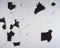
The third and fourth walls had grids of works that seemed to be in conversation with each other and with the several pieces not included in the grid, but on the same wall. (The picture below is from the fourth wall.)


The upper left piece in the picture below (from the third wall), put me pleasantly in mind of one of my favourite works in the Picasso Museum in Antibes, Nicolas de Stael's Le Concert (I've blogged about de Stael previously, here and here). The shape reminded me of a piano, and then, indeed Colman told me a story about finding a piano in the woods... 


This is a view of the same grid from a different direction. Although any photo does not do justice to the original work, as a painter I was drawn to the vibrancy of the colours and the sheer painterliness of the collages! 


The collage form allows for additional layering, whereby juxtapositions of colour become separately defined yet retain their unity with the whole painting. 


Collage allows for a certainty in the creation of a three dimensional space within an abstracted two dimensional work.


Wednesday, 25 August 2021

Diana Copperwhite at Rathfarnham Castle

From Aug 14 to Sept 26 an exhibition of recent work by Diana Copperwhite is (or was, depending on when you might be reading this!) at Rathfarnham Castle. After seeing an artist talk (part of a weekly series from Graphic Studio Dublin during lockdown) where Copperwhite presented her art practice, I was curious to see her work in the flesh. As with the other GSD artist talks, recordings can be seen on YouTube (GSD has its own channel); the recording of Diana Copperwhite's presentation can be viewed here. Because of Covid protocols, it is a good idea to ring Rathfarnham Castle in advance to let them know when you wish to see the exhibition. There is easy signage to direct you in viewing the exhibition though there was no one else there when I attended.  Although I could see work near the bay windows of the large Dining Room I followed the floor arrow through the door to the long Saloon where most of Copperwhite's work was displayed. Her work draws the viewer in because of its intense colour. I was surprised to find that the large curtain was not a draping painting, but actually an industrial print of a painting onto a large curtain!


Other than the large drape, most of the work was on paper and exemplary of Copperwhite's signature style. Since I am having an exhibition of my own work at the Castle next spring, I am also checking out how artist's are displaying their work in the rooms. From previous visits I know their is a lovely fireplace being covered up by that false display wall and will specifically not want this wall used in my exhibition. The beauty of Rathfarnham Castle lies in the architecture and history (that door on the right of the picture below is curved to work with the curved wall, there is plasterwork and paintings in situ on the ceiling!).


Although I have only seen Copperwhite's paintings as part of that artist talk a few months ago, I find I prefer these works on paper to those that she showed in the presentation, which were on canvas. 


Using a mix of watercolour and acrylic, Copperwhite is showing more versatility: there are both soft, transparent areas and harder, more solid areas playing off each other providing an interesting tension.


While the  arrows directed me to the Pistol Loop Room, the work there is not Copperwhite's, it is a group exhibition that I will post pictures of next week. I doubled back to the Dining Room and saw the final two pieces beside the bay windows. 


Wednesday, 14 July 2021

Anonymous Archive part 2 of 2

I blogged last week about anonymously and unexpectedly receiving some of my old work and you can read about that here, because I am now continuing from where I left off.

This print I was very happy to have back, as I do not have any other copies myself, but had never forgotten my work on it. Based on a sketch I did of one of my young nieces asleep, I wanted to recreate that variance in pencil linework and spent many hours of class time in the print room with my zinc plate in an acid bath to create this variance. I remember, in 1981 (my final year at CTS in Toronto) being so pleased that the test print showed the lines as I imagined.


My printmaking teacher convinced me to fill in my minamilist approach with aquatint, which I had never tried before. Although I took a similar attitude with the aquatint - giving it many "baths" in order to have a variance in shadow, I remember being hugely disappointed in the resulting test print. I thought the aquatint overwhelmed the linework.


I am not so disappointed now, though, as I think there is a good contrast between the lines and the shadows. I know I only made a very small edition, but since I have no idea of the provenance of the others, I am quite delighted to have one of the final prints in the edition.


After I finished at the Special Art Programme at CTS, I carried on with my own work as a developing artist. That summer I was very interested in specific flowers as representative of my self. I also made many monoprints, using the backs of zinc etching plates. At this point I do not recall whether these represented red tulips or rosebuds...
 

In the fall of 1981 I started working as a temp in an office in downtown Toronto. Because the employer had a policy that encouraged "staggered hours", I ended up starting work by 7.30 am so that I could go home in the afternoon before rush hour. As winter wore on I found myself at my desk watching the sun rise through the office blinds. I found this broken cityscape view quite inspiring and later did quite a number of sketches of it. I only finally did a large painting in 2015, Fractured City, which was inspred by this time and the sketches I did back then.


I was surprised to see this slightly later work in the Anonymous Archive. Still from the 80s, I did this mixed media piece as part of a series that ended up being exhibited in Winters Gallery at York University (while I was in my final year there in 1986) and then at Charyk Gallery in Downsview. At the time I was very interested in metonymy, visually as well as verbally, where part of the whole represented the whole. In the case of this series, the hand represented the body.


Wednesday, 7 July 2021

Anonymous Archive part 1 of 2

 A few weeks ago I was the recipient of a hit and run dump: the doorbell rang and no one was there but a large, filthy cardboard folder full of really old pieces of artwork had been left at the door. About a third of it was mine, and I knew an estranged sibling was doing a deep clean of their attic.

So, from the "anonymous archive" this is a very early - from grade 11 in high school, 1977 - oil pastel. I actually remember doing it; I was working from a rectangular landscape picture and decided to draw it in a circle, making everything curvy.


I think I must have liked using oil pastels (now I prefer materials more extreme - either chalk pastels or oilsticks - which are on opposite sides of the spectrum). I think this oil pastel still life is from grade 12, late 1977 or early 1978.


When I was in grade 12 I received a scholarship to the Art Gallery of Ontario's Gallery School, which meant I had unlimited access to the gallery, and art classes on Saturday mornings. I was totally thrilled with the arrangement. The artist/teachers divided the classes into rotating groups to do life drawing, plaster mould-making (around clay sculpture) and printmaking. The printmaking module consisted of an introduction to lithography using paper plates rather than stone. I don't know what inspired this preparation sketch, perhaps my ideal landscape?


I was really surprised to see this print again, I had completely forgotten about it - I remembered learning about the principles of lithography and I remembered using a paper plate rather than stone, but I did not remember the image at all. Printmaking was my last module at the Gallery School, so it would have been created during the spring of 1978.


I started art school in September 1978 at Central Technical School's 3-Year Special Adult Art Programme, which was a free post-secondary art programme run out of a high school (though in a separate art building) by the Toronto Board of Education. The programme had a long history as it was founded to train returning veterans of WW1 into commercial art. The programme had a very good reputation for training would-be artists in both commercial and fine art as well as craft, with extensive facilities for sculpture, illustration, ceramics, photography, printmaking, life drawing, etc. In my first year I loved having both life drawing and life painting classes (3 hours each weekly). I still remember this model, Fred, was always very stately when clothed, and totally professional when not. This drawing and watercolour would have been done in early 1978 as we didn't actually "paint" in life painting during the first part of the school year.


Wednesday, 2 April 2014

Classic Abstraction

As I am preparing new abstract work, my thoughts are revisiting classic abstract artists whose work had a great effect on the way I like to paint. I love this picture of Helen Frankenthaler in her studio. I have never had a large work space but have always made good use of the space I have!


A gorgeous, ethereal Frankenthaler painting.


Mark Rothko's paintings have always appealed to me. About 1980 I read Lee Seldes' 1979 book, The Legacy of Mark Rothko, and was convinced that Rothko's suicide was a set-up. Bad dealings of galleries and corporate greed made interesting reading but unfortunately it was a well-researched factual book, not a novel.


I have only gotten to experience the Rothko Room once, when it was still at Tate Britain (it was moved to Tate Modern but must be in storage as the paintings are never on display when I visit London!). I was lucky to have no one else around in the room and was seated on my own. The paintings seemed to hum and open a door into thoughtfulness.


I think it was in 1981 when, with several of art school graduates, I visited the Albright-Knox Gallery in Buffalo. There is a large collection of Clyfford Still paintings there which are huge. I remember being hugely impressed by their colour and size!


Abstraction was also happening in Canada in the same time frame as the New York school of classic abstract expressionism (1950s) and being in art school in Toronto I became familiar with Canadian content! I liked the work of Paul Emile Borduas.


There was a huge show in the Art Gallery of Ontario of Gershon Iskowitz in the early 1980s. Again I could not fail to be impressed by the size and colour of his paintings.


Jack Bush is probably the best known of the Canadian abstract artists.


Another American abstract artist whose work appeals to me is Robert Motherwell.


I love seeing work from Motherwell's Elegy series. I can imagine myself painting the paintings with large brushes, plenty of space, etc. A painting fantasy!


I probably saw the work of Richard Diebenkorn on visits to museums in New York in the early 80s.


It is the application of paint and working out of composition in his work that really appeals to me.


It is Diebenkorn's work which is echoing in my mind when I am thinking of my next paintings Fever Afterimages.