Wednesday, 31 August 2022

Gatineau - outdoor artworks part 2 of 3

While I was in Canada in July, the last leg of my trip was in Ottawa. I spent a day walking Le sentier culturel (the culture path) in Gatineau across the river and I saw so much artwork that I figured I had to devote several blog posts to it; this is the second and the first is here.

This mural was designed by José Guénette as a reminder that the area has a history of being ravaged by fires, but also a reminder of the major (past) employer of the area, the EB Eddy Match Co. The children - of any time - act as witnesses to the events of any era. These particular children could easily represent children of employees from a century ago or children now.


Place Aubry is a small pedestrian area in the middle of the downtown core. Walking in from the street I was drawn to the faux fountain where various colourful animals appeared to be drinking.


 M Chadid's Havre de paix provided a colourful comment in three dimensions wondering if even predators can live together in peace with their prey.


I could hardly miss the flock of butterflies soaring in the space between the buildings!


Samuelle Desjardins' Des ailes pour notre région (Wings for our region) took flight overhead!


A short block away there were several more murals. The jazzy covering of a complete building is a celebration of this area’s past as “Little Chicago” (though according to Wikipedia this is due to crime in the area around the time of Prohibition). 


This past is brought to life by Philippe Landry and Marin Mitrasinovic.  


Although this building mural was also lively and colourful (and next door to the other one!) it was NOT part of the cultural trail so I do not know who the artists were.


Kitty corner to this was Mitrasinovic’s solo mural, “Pop 60”, to my eyes interesting but not as rich or lively as the jazzy one she did with Landry.

Wednesday, 24 August 2022

Gatineau - outdoor artworks part 1 of 3

While in Ottawa at the end of July, my sister-in-law drove me to nearby Gatineau (PQ) to have a look at “Le Sentier Culturel”, i.e. The Cultural Trail. The artworks were mapped around the centre of the town and one simply had to walk around to have a look at the outdoor work. It was a lovely day – a bit overcast and not as hot as other days, so it was perfect for walking about. At most spots on the trail, there was a little display box of brochures that gave information about each stop along the way. Although I had looked at the website the night before, it was handy to have the brochure with me as I walked through the streets.


After parking the car, the first work we came across was number 8 on the list, Bordalo II's One man's trash is another man's treasure. This huge and colourful wall sculpture - if it was on a smaller scale I might have called it a collage! - was made entirely from repurposed garbage.


Across the road from this sculpture was a civic square and several works on the trail were found here. The colourful entrance to the square was NOT part of the trail but is an indication of the vibrant sensibility of Gatineau. Please note that the appearance of a deserted city is due to this being a business area and not only was it Saturday, but it was a long weekend when I visited! 


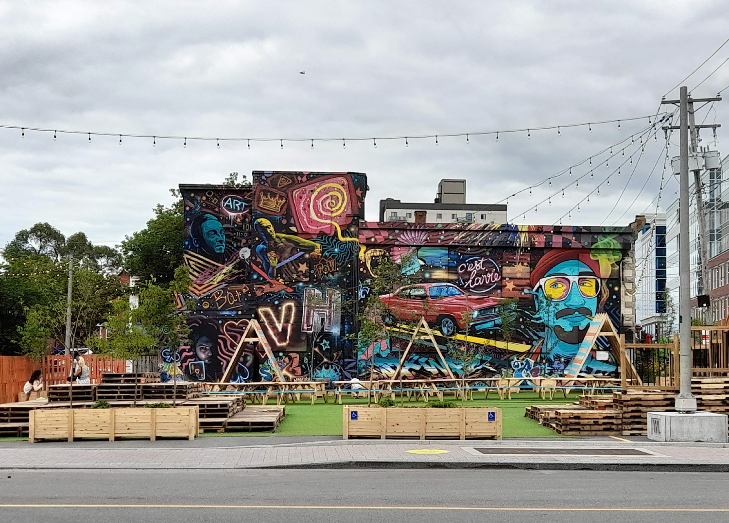
This playful mural on the side of one of the buildings was also not part of the trail, just another indication of Gatineau's sensibility.


I was delighted to see this work in the flesh - from one of the pictures on the website, I had already picked Mathieu Fecteau's sculpture of boats as my favourite work on the trail. Je t'appelerai bateau-feu bateau-lumière (the title - I shall call you fireboat lightboat) was excerpted from a 2018 poem by Agnès Riverin.


 I love the way the sculpture references paper boats from childhood and I love them appearing as if stained glass. I also loved the way the bright colours of the boats reflected in the glass of surrounding buildings and in the rippling water of the fountain pool.


I am not sure of the materials used - being in the middle of a fountain, I could not get a close-up look!


From a distance I could see what looked like a pair of binoculars, but it was the sculptural element of a sound piece that was unfortunately broken on my visit. The large white bone-like sculpture was an artwork that was not part of the cultural trail. When I got a closer view of it the white did not seem so luminous. In fact, this work from the 1970s was in need of a bit of TLC as the paint was peeling and it looked like a few repair jobs had been haphazardly carried out over its lifetime.


I was curious about this bright little pavilion, but did not see a reference to its maker/designer in the brochure. 

The brochure describes Espace sensible as a series of exhibitions commissioned by Artch, an organisation that is specifically interested in the work of emerging curators and artists. 


While I was there, there was work by several artists but there was no indication of how long this work would be available for viewing or what the next exhibit would be. 


I was most curious about the pavilion itself, rather than the work displayed within it.

In any case, it was great to be able to walk around and enjoy the outdoor works. There is more to come, as I took lots of photos, so this will be my topic for the next few weeks (two more blog posts)

Wednesday, 17 August 2022

Patrick MacAllister at The Mermaid

I realised last week that Pat MacAllister's exhibition, "Peering Out", was going to close soon, so I hightailed it over to The Mermaid Arts Centre here in Bray to have a look. I had covid when the exhibition was launched so could not attend, though it would have been nice to see Pat as I hadn't seen him in years. As well as an exhibition of work, I am also always interested to see how a body of work is laid out in a particular space - there seems be a unique solution applied to different exhibitions. At the Mermaid, the gallery is usually accessed by a stairwell (there is a disability elevator available) from the main floor lobby.


I was attracted to the black and white images that faced me as I came up the stairs. It has been many years since I have seen Pat's work, which I remember as colourful and non-objective so I was also surprised at what seemed to me as figuration popping from the black and white canvases.


Indeed, it wasn't just the impasto playing with my perception - there definitely were a crowd of people (albeit loosely painted) expressionistically depicted in this painting. 


This work entitled "Lockout 2", from 2018, had an explanatory didactic next to it and the viewer got a sense, through paint, of the historical industrial dispute in Dublin in 1913. 


Although the pieces that I first came across in the gallery were probably just as interesting to view, I made a bee-line for the larger paintings, which drew me to them through the extra wall that seemed to contain them in a way that made them special.


Likewise, the small room to the side and back was attractive because it had been painted a dark grey unlike the white of the rest of the gallery.


The pieces here were smaller than the other ones in the gallery but they suited this intimate environment and they had a "large" impact.


This was one of my favourite pieces in the show. The work itself is reminiscent of a map in my mind, with representations of game markers, yet it depicts no known map and no specific game. I look at it as a totally non-objective painting but it doesn't bring me back to Pat's old work that I remember. On the contrary, I see it as a move forward for his style. 
 

Wednesday, 10 August 2022

poetry

I was delighted to finally be able to pick up my copy of Stride, the latest book of poetry by Jim Trainer, whose poetry, prose and music I have been following for a number of years. Though the book was published before xmas last year, I had it posted to Canada, knowing that I'd be visiting this summer, as a protest against An Post's practice of double taxarion, which Revenue Ireland turns a blind eye to. In the end Revenue gets the tax income so they are happy enough to ignore any methods used by other government bodies. Not sure what An Post's reason is for deciding to tax on the postage from another country that already charges tax (and hence that is included with delivery costs of any item from anywhere!) but the excuse of "Brexit" doesn't hold water.


I was also happy to get the gorgeous black & silver broadside of the poem Recurrent.


While I was away my own poem, Theft, was published in Remington Review and I was delighted to be included in this online journal among other talented writers and artists.


Here is the poem Theft:

Wednesday, 3 August 2022

return to Toronto

 It's been awhile since I've been back to the city of my birth and youth, but a trip to North America brought me to Greater Toronto Area for a few days. I stayed with friends in Aurora and was surprised when a gift jewellery box that I had made years ago was pulled out for my perusal. I had absolutely no recollection of painting this tin, just a few inches in diameter. There was no identifiable signature or date, but it was most definitely my work and, because of the dream imagery, I estimate that I made it sometime between 1987 and 1992. The paint job has held up pretty well on whatever surface this tin originally provided!


This is actually the underside of the tin, though from the way the jewellery is placed within, I presume my friend prefers this side.


At my friend's house this miniature self-portrait has pride of place on a living room shelf. I do remember creating this, as part of a series of b&w selfies, while on holiday in Ireland in 1987. I used discarded postcards from an aunt's shop and my original intention was to post the pieces to various friends. I decided not to use the postal system as I was sure the paintings would get damaged.


On my final day in the city I went to Toronto Islands where some friends live on Ward's Island. It was a perfect way to spend a hot summer day, even getting in a swim in Lake Ontario - it's been a long time!

Friday, 22 July 2022

Printing on textiles - summer course at NCAD part 2

I previously blogged about the Introduction to Printing on Textiles course that I did a few weeks ago here. This is the second part of that account of my adventures at NCAD. I was thinking about French painter, Henri Rousseau, when I was figuring out imagery for my linen napkins. Here is one of his most famous paintings, The Dream.


After seeing the heat press demonstrations with foliage, I had an idea that I wanted the linen napkins to have a lush foliage design and I kept thinking of Rousseau's work. Here is another of his paintings showing what was in my mind.


I started out thinking that I wanted an overall background colour of green, so painted a sheet of newsprint (with the special ink for the heat press) that was roughly the same size as the napkins.
 

I used the negatives from the Yupo paper to block out the wild rose, and various bits of foliage to block out areas that I did not want the overall colour to go on. The Yupo paper, which is synthetic, melted in the heat press! But I decided it was an unnecessary precaution anyway as the fuschi screenprint of the wild rose was a stronger colour than anything to overlay it. I also decided that I didn't really like the white foliage areas, even if I did like the foliage shapes.


So I painted some other greens on newsprint and ripped pieces to make a sort of collage of colour, including cut-out leaf shapes and real foliage.


This random collage and colour was more satisfactory to my sensibility and my plans were then to just keep layering as I went along.


The class was a small group, so by time my collage layer was ready, the heat-press was free and it was my turn to do another sixty second countdown.


Up until it was time to clean up on the last day, I was working on my layers. I photographed the finished napkins on a bench outside the work room and the sun was absolutely streaming through the huge windows.


These pictures give some sense of the finished napkins. The colour seems fairly correct on the wild rose, but the individuality of all the foliage is easier to discern in real life.


As well as Rousseau for the foliage, I think I was also channeling Botticelli's Birth of Venus by having the silkscreened goddesses emerge from the wild rose. It was an intense, productive and fun week learning this process!

Wednesday, 13 July 2022

Printing on textiles - summer course at NCAD part 1

A couple of weeks ago I attended the Introduction to Printing on Textiles week-long summer course at the National College of Art & Design (NCAD) in Dublin. The experienced, patient, wonderful and lovely tutor was artist Mel Bradley. On the first day she introduced the small class to heat press printing on synthetic fabrics so that we could gain some understanding of the possibilities of this process. The day was one of experimentation and fun!


On the second day Mel gave some demonstrations of silk-screening on fabric and how to create our own stencil designs using newsprint and/or Yupo paper (a more robust synthetic paper).


Mel's demonstrations, of course, made everything look so easy, but she was also using very simple techniques and basic shapes to prove that designs did not need to be complicated to be beautiful.


When I got to the class on Tuesday morning, Mel and her assistant, Tríona, were preparing workboards for everyone, which was soft on one side and covered with wipeable oilcloth, and hard wood on the other side for cutting. This is my workboard in my workspace before I started working!


I cut out a basic wild rose stencil from Yupo paper to be my basic screen image. I had brought in six linen napkins that I wanted to refresh with textile design and I also brought in four tiny silkscreens of archaeological goddess images from different cultures (for instance, an image of the Venus of Willendorf and  an image of an ancient Egyptian Venus) that I had prepared many years ago.


This is the wild rose silkscreened onto the first linen napkin. As you can see, the cloth must be taped down to the soft part of the workboard before screening.


Here are two napkins with both the image of wild rose and goddesses screened on them, hanging on the wall to dry completely before I do anything else to them.


Midweek I brought a few acetate rose leaf stencils into the class thinking I might use them. My husband had made these stencils when he was painting his suit jacket for our wedding in 1995. Here I used a hard round brush to stipple ink onto the linen through the stencil, but decided this process took too long and it wasn't actually what I had in mind for the napkins. Though I knew already that the heat press process and inks would not be as intense on natural fibres (such as linen) I decided that it was this process that I was most interested in and planned to spend the last two days with working on foliage to get all six napkins completed by the end of the course. I'll continue with the results on the next blog!