Showing posts with label wild roses. Show all posts

Friday, 22 July 2022

Printing on textiles - summer course at NCAD part 2

I previously blogged about the Introduction to Printing on Textiles course that I did a few weeks ago here. This is the second part of that account of my adventures at NCAD. I was thinking about French painter, Henri Rousseau, when I was figuring out imagery for my linen napkins. Here is one of his most famous paintings, The Dream.


After seeing the heat press demonstrations with foliage, I had an idea that I wanted the linen napkins to have a lush foliage design and I kept thinking of Rousseau's work. Here is another of his paintings showing what was in my mind.


I started out thinking that I wanted an overall background colour of green, so painted a sheet of newsprint (with the special ink for the heat press) that was roughly the same size as the napkins.
 

I used the negatives from the Yupo paper to block out the wild rose, and various bits of foliage to block out areas that I did not want the overall colour to go on. The Yupo paper, which is synthetic, melted in the heat press! But I decided it was an unnecessary precaution anyway as the fuschi screenprint of the wild rose was a stronger colour than anything to overlay it. I also decided that I didn't really like the white foliage areas, even if I did like the foliage shapes.


So I painted some other greens on newsprint and ripped pieces to make a sort of collage of colour, including cut-out leaf shapes and real foliage.


This random collage and colour was more satisfactory to my sensibility and my plans were then to just keep layering as I went along.


The class was a small group, so by time my collage layer was ready, the heat-press was free and it was my turn to do another sixty second countdown.


Up until it was time to clean up on the last day, I was working on my layers. I photographed the finished napkins on a bench outside the work room and the sun was absolutely streaming through the huge windows.


These pictures give some sense of the finished napkins. The colour seems fairly correct on the wild rose, but the individuality of all the foliage is easier to discern in real life.


As well as Rousseau for the foliage, I think I was also channeling Botticelli's Birth of Venus by having the silkscreened goddesses emerge from the wild rose. It was an intense, productive and fun week learning this process!

Wednesday, 13 July 2022

Printing on textiles - summer course at NCAD part 1

A couple of weeks ago I attended the Introduction to Printing on Textiles week-long summer course at the National College of Art & Design (NCAD) in Dublin. The experienced, patient, wonderful and lovely tutor was artist Mel Bradley. On the first day she introduced the small class to heat press printing on synthetic fabrics so that we could gain some understanding of the possibilities of this process. The day was one of experimentation and fun!


On the second day Mel gave some demonstrations of silk-screening on fabric and how to create our own stencil designs using newsprint and/or Yupo paper (a more robust synthetic paper).


Mel's demonstrations, of course, made everything look so easy, but she was also using very simple techniques and basic shapes to prove that designs did not need to be complicated to be beautiful.


When I got to the class on Tuesday morning, Mel and her assistant, TrĂ­ona, were preparing workboards for everyone, which was soft on one side and covered with wipeable oilcloth, and hard wood on the other side for cutting. This is my workboard in my workspace before I started working!


I cut out a basic wild rose stencil from Yupo paper to be my basic screen image. I had brought in six linen napkins that I wanted to refresh with textile design and I also brought in four tiny silkscreens of archaeological goddess images from different cultures (for instance, an image of the Venus of Willendorf and  an image of an ancient Egyptian Venus) that I had prepared many years ago.


This is the wild rose silkscreened onto the first linen napkin. As you can see, the cloth must be taped down to the soft part of the workboard before screening.


Here are two napkins with both the image of wild rose and goddesses screened on them, hanging on the wall to dry completely before I do anything else to them.


Midweek I brought a few acetate rose leaf stencils into the class thinking I might use them. My husband had made these stencils when he was painting his suit jacket for our wedding in 1995. Here I used a hard round brush to stipple ink onto the linen through the stencil, but decided this process took too long and it wasn't actually what I had in mind for the napkins. Though I knew already that the heat press process and inks would not be as intense on natural fibres (such as linen) I decided that it was this process that I was most interested in and planned to spend the last two days with working on foliage to get all six napkins completed by the end of the course. I'll continue with the results on the next blog!

Wednesday, 24 March 2021

painting

I am working slowly but steadily on the large painting, Knockeen, which is based on my memories of the place and events of my time at the second house I lived in, in Kerry, from the spring of 1995 to the fall of '96 (when I returned to Bray). To bring you up to speed, I previously blogged about starting this painting here and its very early stages here. In the last week of February it looked like this.


I started adding some darker blue into the night section of the sky, several of the calla lilies (from a dream), the blue glass ball on the gate, and I used blue to start the delineation of the animals (cows and people). Several years ago, I posted pictures of a couple of works on paper that are relevant to this painting, their subject matters being the Kerry night sky and Comet Hyakutake in one, and the field gate and ruin in the other. You can check out those images and that post here.


Here is a close-up of the blocked-in callalilies. I had never seen so many callalilies till I moved to Kerry. Huge bunches of the white flowers graced country lawns, but when I dreamt of them they were pink and blue.


I knew I wanted a deeper green around the flowers than I had first blocked in, so I mixed a different colour. This also added a more definite shape to the flowers.


Here is a more detailed picture of the figures and cows being delineated by blue.


I added in some more purple (dioxazine violet) as my preferred stand-in for black, delineating the ruins, the two outbuildings, and some of the clothing on the figures.


No, I did not use brown for hair or an outbuilding - this is a mix of dioxazine violet, cadmium red medium and a smidgen of cadmium yellow light! Another shade of green can be seen in the bush here too. I also used some titanium white on the cows and t-shirt of the woman, plus some pale pink for the snouts of the beasts. Coming along nicely!


Wednesday, 20 May 2020

Knockeen - preparations for new large painting

I am getting ready to embark on another large painting for the Memory Is My Homeland series. After moving to Ireland in the winter of 1993, we moved to Kerry early in the new year of 1994. We rented a house at Darby's Bridge and got married the following year. I think our landlord was very worried that we were getting too ensconced in our little village (the whole village celebrated our wedding, both before and on the day!) and pulled the rug out from under our rental. As we were not ready to leave Kerry just yet, we had a fair bit of help (both human and supernatural!) in finding another place to live. Knockeen, just outside Portmagee, was our rural home for the next year and a half. It is representative of the huge part of my life as an emigrant, getting settled, living rurally, being married, and continuing with my creative life. My Dad also died in 1995, which precipitated my return to civilisation the following year. But in the meantime, there was so much that I remember about this place: the brisk swims in Portmagee Channel (behind our house), the most amazing blackberries from our own boreen, the fuchsia hedges on the roadside, the brilliant red-orange montbretia and wild roses winding and beneath those hedges, the ubiquitous and mischievious cows, the smell and look of grassy wedges of unprocessed turf, the phenomenal night sky with no light pollution - perfect views of the river of the Milky Way and Comet Hyakutake, and so much more. Of course, even for a large painting I have to pick and choose what concepts will be represented.  I sketched the composition I had in my head. I inluded blackberries, calla lillies (I saw these for the first time in rural Kerry gardens and used them in an installation tribute to my Dad; I blog about that here), fuschia, wild roses, the buildings of the house, sheds, and ruins, the gate that led to the field at the front of the house, the night sky, and of course several cows.


I envisage this as mostly a daylight painting, but insist that Comet Hyakutake and the night sky must make an appearance. When I was in Venice last October, I visited the Peggy Guggenheim collection and this Magritte painting, Empire of Light, has night and day together, so my painting won't be the first to introduce such an anomaly. Whereas Magritte's painting is disturbing and somewhat menacing, I am adding the night sky in recognition of it's magnificence - the feeling of natural awe.


As everything is blooming at the moment, it was easy enough for me to simply go outside and sketch some of the foliage from the wild rose in the front yard. It is the same plant that was across the road from our house in Darby's Bridge, which we brought with us when we moved to Knockeen and planted beside the gate, then uprooted it again to bring with us when we moved back to Bray in 1996.


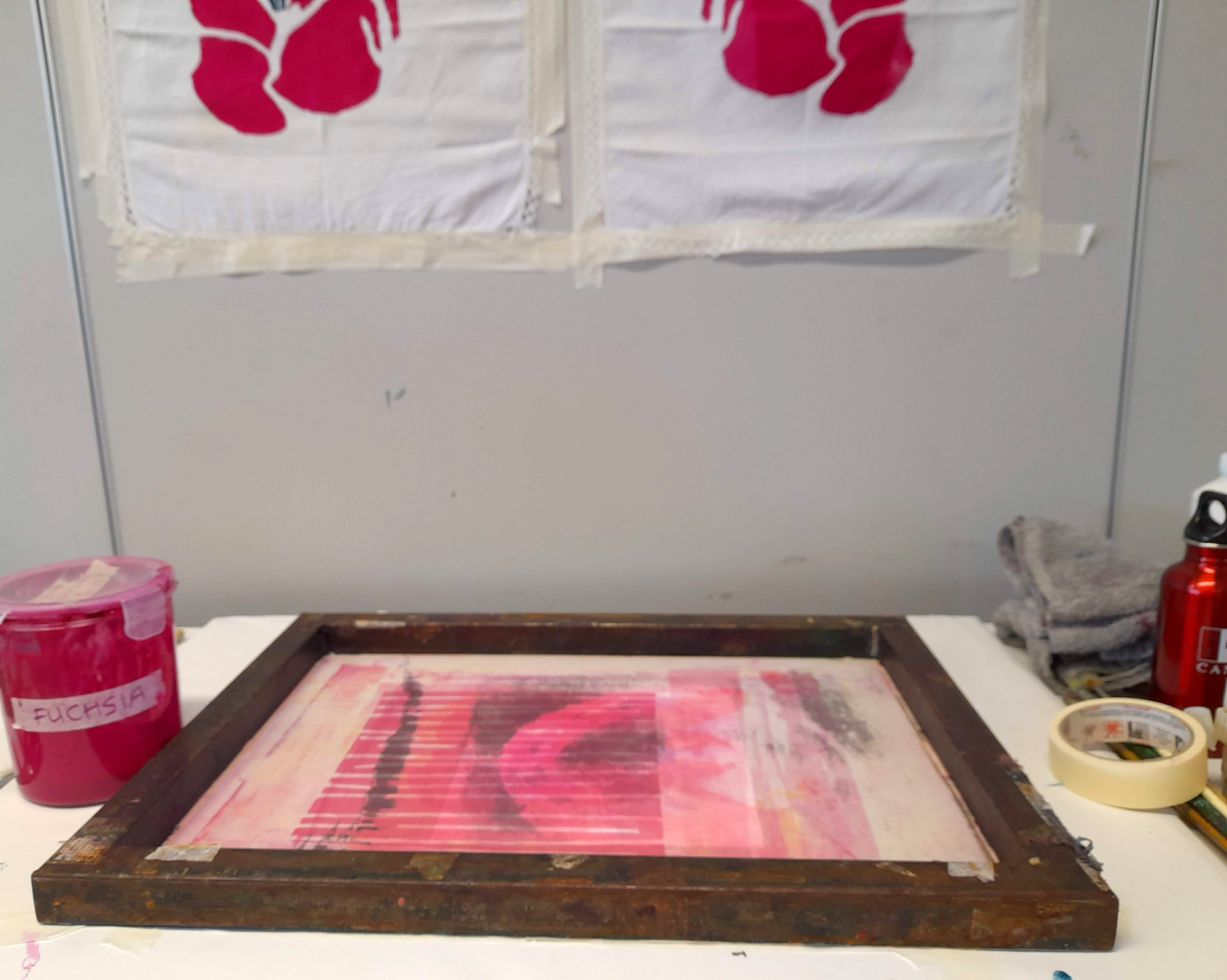
There is a wild fuschia hedge in the front yard too. The wild cuttings overtook the garden varieties when we planted them outside the current house when we moved here nearly 18 years ago. Each year the hedge grows to a massive size, which the bees love, and gets cut back in the winter.


I did a colour composition sketch that has all the elements and general placements that will appear in the final painting. I was looking at some previous work I have done related to Knockeen here and here. In the earlier image of the comet, it appeared in the sky at a different angle so I will probably be changing that in the final painting. A few more research drawings and I'll be ready to start!

Wednesday, 1 August 2018

Foliage bowls - Part 2

I was ecstatic when my two foliage bowls came out of their final firing in the way I had hoped! With ceramics there is always the chance for something to go not-as-planned, so one has to leave expectations at the workshop door and accept concepts of happy (or otherwise) accidents and random results.


My intention when glazing these bowls was that a green glaze, painted on then wiped off again, would fill the design crevices. And indeed, this worked! Some of the crevices were deeper than others (the stems) caused by me pressing the soft clay into the foliage when creating the bowls in their formers. See my previous post here for details.


Another participant in the workshop has been getting beautiful results with several glazes mixing and running into each other when heated. Although there is the risk of the glazes running too much and a pot sticking to the kiln shelf when these glazes are used on the exterior of a pot, I was hoping that there would be no trouble if the glazes were used on the inside of the bowls. There were three glazes painted on the bowl interior: a base colour of green and then more random painting strokes of a particular blue and another green.


The extra swirling effect is caused by initial pressing of the clay when creating the bowls. It is the wild rose leaf bowl interior above and the fern bowl interior below.


The ferns presented a completely different pattern than the wild rose leaves, but again, there is lighter and darker lines reflecting the depth of the crevices which held the glaze. In each bowl there is also a subtle glaze under-pattern caused by the wrinkles in the cling film from the initial forming of the bowls.


Wednesday, 25 July 2018

Foliage bowls - Part 1

In the ceramics workshop at Signal Arts Centre in Bray, I decided to try out a new way of designing handbuilt bowls.  Still using the pudding bowls as formers (lined with cling film so that the clay doesn't stick to the bowl) I brought in ferns and wild rose leaves from my yard. I rolled out slabs and cut random shapes that I pressed into the bowl formers, which were also lined with the foliage.


My plan was that I would press the clay into the foliage hard enough that the patterns would remain once the foliage was removed. Though the bowls were free standing alreay, I wanted simple "feet" on them to increase the elegance of the finished bowl, lifting it from a table surface. The feet for both bowls were made simply from slabs that curved around the bottom of the bowls and joined with the scoring, slip and vinegar technique.


Both bowls have their feet, the ferrn bowl is upside down to show off it's foot.


Though the fern bowl's foot is slightly taller, the bowls are approximately the same size at 12 cm.


I carefully removed most of the foliage before putting the bowls in the bisque firing, but any that seemed too embedded was left to burn off in the kiln. This is the bisqued wild rose leaf bowl showing the fluff from the foliage that burnt off in the kiln. This fluff is easy to remove by blowing off or brushing off before glazing. I was thrilled at the detail from the foliage, which provided a great pattern. I immediately knew how it would be glazed -- details next post!


Wednesday, 26 August 2015

New drawing materials!

Over the past year or so I have been happily using watercolour pencils while doing sketches en plein air. A friend in Canada who was aware of these sketching forays asked if I had tried watercolour pens; I was curious as I had never heard of these before. When I was in Toronto in July and met this friend for coffee, I was delighted at her gift for me -- watercolour pens. Their nibs are actually brushes of varying thicknesses and they have a reservoir that you fill with water. They are perfect for outdoor sketching in conjunction with watercolour pencils.


As with most things, the watercolour pens take some practice as you must squeeze the reservoir gently for the water to flow into the brush-nib. Squeeze too hard and you get a blob of water where you didn't want it! This sketch is of the wild roses in our front yard. using pencil, watercolour pencils and watercolour pens.


On Sunday just past, I attended a calligraphy workshop in Ashford as part of Heritage Week. Another new implement of which I was previously unaware is the calligraphy pen. I have done calligraphy with metal pen nibs & holders and reed pens but had never come across this simple chiselled marker purpose-specific. The woman giving the workshop considered it a beginner's no mess-no fuss tool; beginner or not, I really liked using it!


Wednesday, 20 March 2013

The Big Egg Hunt - Farewell!

This morning I was in Dublin for the Big Egg Hunt artist event and photocall. It was great to see all the eggs gathered in one basket (so to speak).  Impossible though to take a picture to show all 100 in the T-space of the building, plus the side gallery. Here is mine, Wild Roses, in the foreground, Lynda Cookson's Aspirations in the middle ground, and James's Hilbert Curve just beyond (then the others become a colourful blur).


A view of the other row of eggs (the floor plan was like a big T -- two rows going down the stem and then bunches at either side of the entrance.  There was also a gallery with the 30 something eggs which will be auctioned live on Saturday night at the gala event.


And I was giving my egg a big hug goodbye, as today will probably be the last time I see it.  There have been bidders, so it will go to someone at the end of March.


Tuesday, 12 March 2013

Good Egg Hunting!

Yesterday, despite the freezing climate, we ventured into Dublin to find some of the eggs.  Mine was tucked away inside Dublin Castle grounds, near to the Chester Beatty Library.  There was a tiny bit of damage done to "Wild Roses" -- a bit of blue paint chipped off, probably in the siting move, leaving a tiny circle of white.  Though probably not noticeable to most people, I will touch it up next week when the eggs are all brought together in a space at the IFSC in Dublin.  That will be my final goodbye to this egg.  :)


Painter Felim Egan's egg is so much more beautiful than any photo can show.  He is a well known painter whose work is in the National Gallery, and this simply is one of his paintings wrapped around an egg shape.  It an encaustic painting and deliciously tactile.  This egg was also in Dublin Castle grounds.


I watched some Facebook postings of Lynda Cookson's egg "Aspirations" in progress.  I love the painting!  It was found in Powerscourt Townhouse shopping centre.


Niamh O'Connor's "Laced" was also at Powerscourt Townhouse.


Again, all the photos I had seen of this piece did not do it justice.  There is an amazing amount of detail of pressed lace; again this is an encaustic egg which is absolutely beautiful!


We moved on to Brown Thomas on Grafton St.  This is a shop that has a doorman wearing livery and a top hat...  James Hayes's Hilbert Curve was in among the very expensive shoe department.  A member of staff very kindly offered to take our picture around the egg, and was chuffed that one of our party was the artist (James is my husband).


There was nice lighting on Hilbert Curve, and a very large mirror nearby.


We were surprised that designer Louise Kennedy's "La Duchesse" seemed to be tucked away in a not very interesting spot beside the elevators.


As can be expected from a designer of Kennedy's calibre, La Duchesse is tres elegant, but again, most photos I have seen of it belie what the eye sees in person.


Another well known designer of elegance, John Rocha, created this sparkly egg which we found appropriately in the Tiffany area of Brown Thomas.  Any photos I have seen of this are completely missing its sparkle.


We zoomed around St. Stephen's Green finding the eggs there, and then dived for cover in the warmth of the nearby shopping centre where there were more eggs.  My absolute favourite of all the eggs, seen in photos and live, has got to be Jordi Fornies "Treeborn".  It made my day to be able to see it in person.