Showing posts with label floral images. Show all posts

Friday, 22 July 2022

Printing on textiles - summer course at NCAD part 2

I previously blogged about the Introduction to Printing on Textiles course that I did a few weeks ago here. This is the second part of that account of my adventures at NCAD. I was thinking about French painter, Henri Rousseau, when I was figuring out imagery for my linen napkins. Here is one of his most famous paintings, The Dream.


After seeing the heat press demonstrations with foliage, I had an idea that I wanted the linen napkins to have a lush foliage design and I kept thinking of Rousseau's work. Here is another of his paintings showing what was in my mind.


I started out thinking that I wanted an overall background colour of green, so painted a sheet of newsprint (with the special ink for the heat press) that was roughly the same size as the napkins.
 

I used the negatives from the Yupo paper to block out the wild rose, and various bits of foliage to block out areas that I did not want the overall colour to go on. The Yupo paper, which is synthetic, melted in the heat press! But I decided it was an unnecessary precaution anyway as the fuschi screenprint of the wild rose was a stronger colour than anything to overlay it. I also decided that I didn't really like the white foliage areas, even if I did like the foliage shapes.


So I painted some other greens on newsprint and ripped pieces to make a sort of collage of colour, including cut-out leaf shapes and real foliage.


This random collage and colour was more satisfactory to my sensibility and my plans were then to just keep layering as I went along.


The class was a small group, so by time my collage layer was ready, the heat-press was free and it was my turn to do another sixty second countdown.


Up until it was time to clean up on the last day, I was working on my layers. I photographed the finished napkins on a bench outside the work room and the sun was absolutely streaming through the huge windows.


These pictures give some sense of the finished napkins. The colour seems fairly correct on the wild rose, but the individuality of all the foliage is easier to discern in real life.


As well as Rousseau for the foliage, I think I was also channeling Botticelli's Birth of Venus by having the silkscreened goddesses emerge from the wild rose. It was an intense, productive and fun week learning this process!

Wednesday, 13 July 2022

Printing on textiles - summer course at NCAD part 1

A couple of weeks ago I attended the Introduction to Printing on Textiles week-long summer course at the National College of Art & Design (NCAD) in Dublin. The experienced, patient, wonderful and lovely tutor was artist Mel Bradley. On the first day she introduced the small class to heat press printing on synthetic fabrics so that we could gain some understanding of the possibilities of this process. The day was one of experimentation and fun!


On the second day Mel gave some demonstrations of silk-screening on fabric and how to create our own stencil designs using newsprint and/or Yupo paper (a more robust synthetic paper).


Mel's demonstrations, of course, made everything look so easy, but she was also using very simple techniques and basic shapes to prove that designs did not need to be complicated to be beautiful.


When I got to the class on Tuesday morning, Mel and her assistant, TrĂ­ona, were preparing workboards for everyone, which was soft on one side and covered with wipeable oilcloth, and hard wood on the other side for cutting. This is my workboard in my workspace before I started working!


I cut out a basic wild rose stencil from Yupo paper to be my basic screen image. I had brought in six linen napkins that I wanted to refresh with textile design and I also brought in four tiny silkscreens of archaeological goddess images from different cultures (for instance, an image of the Venus of Willendorf and  an image of an ancient Egyptian Venus) that I had prepared many years ago.


This is the wild rose silkscreened onto the first linen napkin. As you can see, the cloth must be taped down to the soft part of the workboard before screening.


Here are two napkins with both the image of wild rose and goddesses screened on them, hanging on the wall to dry completely before I do anything else to them.


Midweek I brought a few acetate rose leaf stencils into the class thinking I might use them. My husband had made these stencils when he was painting his suit jacket for our wedding in 1995. Here I used a hard round brush to stipple ink onto the linen through the stencil, but decided this process took too long and it wasn't actually what I had in mind for the napkins. Though I knew already that the heat press process and inks would not be as intense on natural fibres (such as linen) I decided that it was this process that I was most interested in and planned to spend the last two days with working on foliage to get all six napkins completed by the end of the course. I'll continue with the results on the next blog!

Wednesday, 1 June 2022

inspired by flowers

I always seem to be noticing flowers and admit that I find them inspiring! Wisteria hasn't yet entered my painted repertoire, but I always stop to look at it when I see it. This picture was taken a couple of months ago before the flowers were fully in bloom. I was in Dublin that morning and just had to stop and snap the trained wildness over this doorfront.


My absolute favourite example of the trained wildness that is wisteria is this magical portal here in Bray. I used to live up the street from this house so watched it bloom every year.


This is one of my favourite gardens in Bray, and right next to the wisteria gate is a gorgeous magnolia tree. As the tree is so close to the footpath it was easy for me to do sketches of the flowers in different phases of bloom when I lived so close by.


The result of my sketching that particular tree was this acrylic painting that I did in the spring of 1999 and which was included in my Blessings exhibition at Signal Arts Centre that fall. In 2000 the exhibition was again displayed at Cavan County Museum, Ballyjamesduff. It currently resides in a private collection in the US.


As well as working from sketches and photographs flowers also appear in my dreams. When I lived in rural Kerry in the mid-90s I noticed that many people had beautiful and enormous calla lilies in their spacious front gardens. In fact, I think this may have been my first experience of seeing these flowers other than in pictures and I was quite taken with them. So much so that I dreamt about them, albeit in my dream life the flowers were vibrantly coloured. I made this Father's Day collage card in 1995, and a later riffing on these images painted the curtains that became the main part of my installation Dreaming for Dad, which was created as a memorial for my father (he died in September 1995) and exhibited at The Basement Gallery, Dundalk in 1996.


When thinking of seminal images of my home and life in Kerry for my painting Knockeen, the dream calla lilies made a large appearance. This large painting from 2021 was part of my exhibition Memory Is My Homeland at Rathfarnham Castle earlier this year. 

Wednesday, 18 August 2021

Knockeen - finished painting!

I think it was the first week of August that I declared (to myself) that Knockeen was finished and I signed it without further ado. It is a painting that I have been working on for most of this year and I blogged progress reports fairly regularly; you can see the painting's development here, here, here and here.


So here is a picture of the whole painting! Knockeen, acrylic on pressed cloth, approx 228 cm x 200 cm, 2021. I made some changes from the original composition sketch, which you can see here. The red and blue calla lilies reference a dream I had shortly before the death of my father in 1995. While I had not seen real calla lilies till I moved to Kerry, on rural lawns the flowers were always white. I talk about painting those dream flowers here.


Here is a detail from the left side.


This is another detail from the left side. I had decided very early on that I wanted to include a section of the night sky, because the sighting of Comet Hyakutake in 1996 in a completely clear Kerry night sky was amazing! I had also seen René Magritte's painting, Empire of Light, at the Peggy Guggenheim gallery in Venice a couple of years ago, and loved this possibility of painting day and night at the same time. I have previously painted Hyakutake in Knockeen and posted images here and here. (NB in the first link I mis-identify the comet as being Hale-Bopp, which saw in Bray.)


This is a detail from the right side of the painting. I have also used the image of the house and field gate at Knockeen in prints, which you can see here and here. The small gate divided the house from the field in front of it. Sometimes the cows were in it, but more often they were in the field behind or around the house, where they trampled our garden attempts, ate half the straw welcome mat and, no doubt, getting up to mischief in the cramped space behind the shed...


Although only at Knockeen for a year and a half, it was a very creative time for both my husband and myself.


Here is a detail at the bottom of the painting - fuchsia and wild roses are quintessientally Kerry to me.


Wednesday, 15 July 2020

tulip vase

As I realised my time at the ceramics workshops at Signal Arts Centre was coming to an end (I have many other projects that are now taking priority attention, although I foresee returning to ceramics sometime in the future), there was still the matter of the disastrous vase I glaze-painted three years ago. I described full details of this spectacular failure here. However, the vase was sanded and scoured and sitting in a corner periodically beckoning to me. Luckily I actually did return to it in February and worked on re-glazepainting before lockdown.


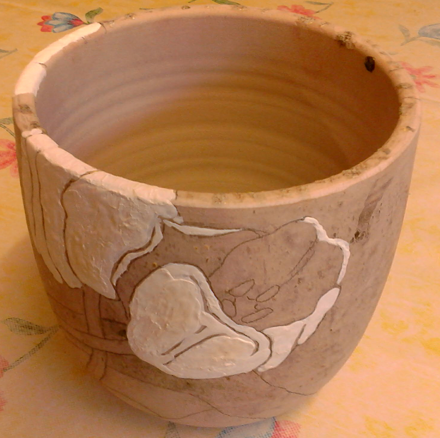
I still wanted to glaze the vase using the original tulip design, and I still have that design as I had been using it as reference for the tulip patterns on my terracotta dinnerware set (I blogged about the bowls here, and that post contains all the links to other parts of the set). I simply applied graphite to the reverse side of the design and traced the floral outlines,


transferring the pattern to the vase.


Then I began, colour by colour, to paint in the design with glaze.


As can be seen here, it wasn't possible to remove all the debris from the initial disaster, so I resolved to simply take the chance on re-glazing and see if these blemishes added an interesting effect to the final vase.


The underlying vase is a pale colour but I decided NOT to glaze paint any outlines on the design this time round. Though the lines between colours appear quite strong in this picture, I expected that it would be more subtle in the firing.


After the disaster of three years ago, I liked the look of the melted blue glass so did not have it removed with the other detritus. I hoped the second attempt at firing the vase would not be unkind to this effect.


I was pleased with the final results.


Signs of the first firing are random and not particularly intrusive (for instance the interior spot visible on the right side in this picture) .


Another view of the fired vase.


This view shows that the stained glass was happy enough with the second firing, showing off it's mix of several colours of blue.


Wednesday, 22 January 2020

Kingswood - large painting

Last spring I started a new body of work based on memories of the homes in which I have lived. I discussed the beginnings of this project here and here. I wrote further about this work in relation to printmaking here and again more about it here. But in the summer I began work on the large painting, Kingswood, representing the house in Toronto where I lived for about 18 formative years. The ground is not canvas, but a type of pressed cloth used for domestic blinds, so there is a type of floral watermark design throughout.


I had a lot of research pix on different flowers (hollyhocks, lilac, apple blossoms, and the tiny white hedge flowers whose name I don't remember) as well as floral sketches, and the main composition sketch that I worked from.


I quickly found out that the ground behaved very differently from ungessoed canvas - REALLY soaking up every drop of paint. I worked loosely and thinned the paint out with water and medium (a mix of matte and gloss).


I had already decided on the 3 figures representing various stages of my life: my very young self on my Communion day (though I neglected to include the bridal veil I wore, I was more interested in the fashionable purple cape made for me by my Mum), my teenage self who spent most summers reading on the front steps of the house. and my young adult self who left home. 


This is a large painting, so it was necessary to use the step ladder to reach areas at the top and I had a cushion to kneel on when working in the bottom areas. The composition sketch was affixed to the wall the whole time I was working.


Any marks made would be visible in the finished painting. This whole painting would also be about process, and I was pleased that nothing would be hidden


There were several lilac trees in the backyard - purple and white lilacs - but my especial interest in the lilac in my painting was the heart-shaped leaves. The crabapple tree bore inedible fruit, but provided great ammunition in our "wars" with neighbourhood friends (a laneway between streets was adjacent to our house, so it was a great fort from which passersby could be pelted),


A plaid shirt and "painter" pants were my favourite clothing articles for a few years in my late teens-early 20s until art school got the better of my fashion sense and long flowy skirts were replaced by punk and neo-punk black.


As planned, I finished and signed the painting by mid-December.

Kingswoodacrylic on pressed cloth, approx 228 cm x 200 cm, 2019