Wednesday 25 September 2019

Carborundum

Since moving to Ireland in 1988, I became aware of a printmaking process that I had never heard about (printmaking was one of my courses in art school). My curiosity has peaked about the process of carborundum since I have become re-interested in printmaking over these past few years. I have looked at a number of courses and workshops, but usually they entail a night class or weekend workshop on the north side of Dublin -- something that would be difficult for me to travel to. So I completely jumped at the chance to attend a workshop being held by Trinity Arts Workshop, near the DART, and not starting till 10 am on a Sunday morning. The facilitator, Daniel Lipstein, outlined a course that would cover whatever aspects of printmaking prospective participants were interested in. I wrote to him, secured a place and he had a variety of plates ready for me to work on when I arrived.


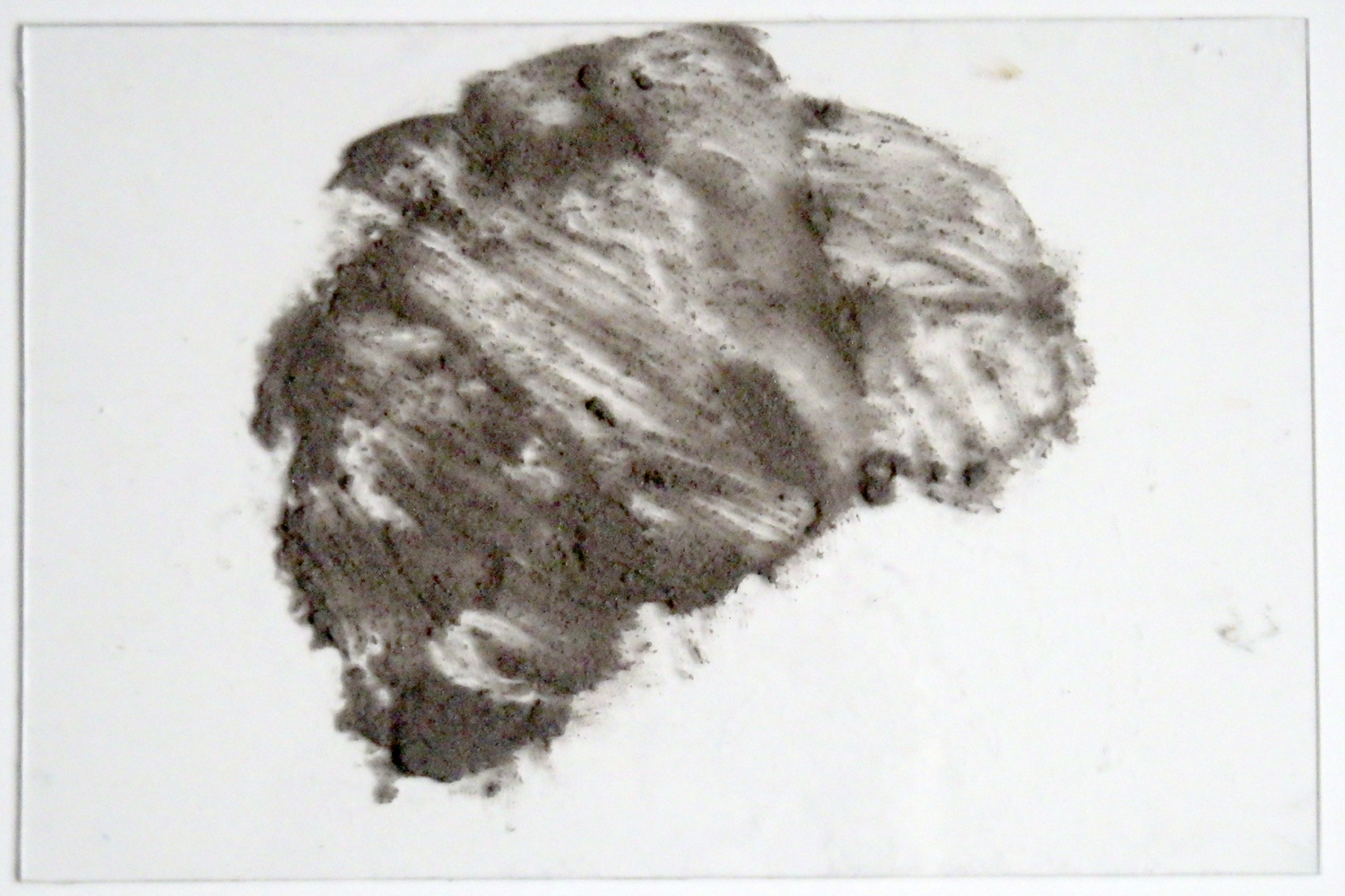
Lipstein explained the process to me with the pre-prepared plates. A mixture of carborundum, a sandy powder, was mixed with pva glue and painted onto a plate (the plates were completely de-greased first with ammonia, water, and chalk powder). After thoroughly drying plates, a design was painted on with either oil paint or oil printing ink. The process was similar to monoprinting, and the first print pull would look simply like a monoprint. The second print would show off the carborundum texture.


The printing process is fairly quick, so I worked on a few of the ready-made plates during the class. The direction of the carborundum on this plate reminded me of the field in front of a house in which I used to live in Kerry, so I made Knockeen the subject of this print.


But I also had a go at mixing the carborundum with pva myself and


preparing my own plate by painting the carborundum/glue mix. It does need to dry thoroughly before painting with oils or ink, and unfortunately this plate only finally dried by the end of the workshop. However, I got a very thorough understanding of the process from the few hours, and look forward to another workshop in a couple of moths, where I can ink this up and print it as well as work on a few other processes that I want to re-visit.


Wednesday 18 September 2019

Then & Now: Janet Mullarney at IMMA

A few weeks ago I was delighted to see the exhibition of sculptural work by Janet Mullarney in the hallowed halls of IMMA. Mullarney was one of the first contemporary Irish artists that really impressed me when I had seen an exhibition of hers at the Project Art Centre about 30 years ago!


Mullarney's figurative work straddles that precarious space between dream and reality, fact and fiction - a space close to my own heart.


I concur with IMMA's description of the exhibition: "Although the works presented are diverse in scale, form and materials, they clearly belong to the distinctive world of Mullarney's imagination. Her underlying concerns with the strangeness, darkness and fragility of the human condition also form a connecting thread." IMMA website


Looking at the pictures and thinking about Mullarney's work now, I see a positive affinity with the work of Louise Bourgeois, another artist that I admire.


Mullarney comes from a classically trained background (Florence, Italy) and divides her time between studios in Ireland and Italy. The exhibition brings together old and new work, though I was surprised NOT to see any of the work I remembered from that early Dublin show that had so impressed me. The exhibition runs till October 13 2019.


Wednesday 11 September 2019

Tulip bowls

In previous blogs I have described the making of bowls and plates through handbuilding, rather than throwing on the wheel. One of my main projects this year, in the ceramics workshop, is to create a dinnerware set. Details of the large and small plates of the dinnerware set can be found here, here, here, and here. Here are two of the bowls for the set after I put the feet on them, using two thin semi-circular slabs.


When the four bowls (it is a quartet tableware set) came out of the bisque fire, I drew the tulip designs directly on them with a pencil. I talk about the bowls and my plans for glazing here.


I started with glaze painting the flowers - two different colours of yellow.


I glaze painted the leaves and stems with "tropic green" a speckly green that I particularly like, but I painted a coat of "apple green" over the stems as I wanted them to vary from the leaves, but still have that nice speckle.


Since a glaze fire was announced, I worked at getting one bowl completely glazed. The background and inside of the bowl are glazed with the same "speckled turquoise" that are on the plates.


I was very happy with the firing results of the bowl! I found out that the tropic green is one of the runnier glazes and really liked that gravity pulled it down a bit to accentuate the terracotta lines. I also enjoy the random dripping into the stem from the leaves.


Here is another view of the first finished tulip bowl. The "speckled turquoise" is a consistently beautiful colour and the interior of the bowl is very smooth.


Another view of the finished bowl! Once I finish glazing the other three bowls, I will start work on 4 mugs to complete the dinnerware set.


Wednesday 4 September 2019

Farmleigh House - nagOffsite installation, Gallery 2

Since Farmleigh House Gallery consists of two separate rooms, I decided to blog about each room individually. Just as the nagOffsite exhibition was related to the nagOffsite exhibition in Rathfarnham Castle, so too was gallery one related to gallery two. Both galleries were warmly and dimly lit with spotlights highlighting the work; this warmth and lighting conducive to observation and contemplation.


Impossible to photograph, the elegant "weaving" paintings on wood panels by Kohei Nakata were precise and calming, the woodgrain providing a natural foil to the symmetry of the paintings and


the pearl paint lines having a fragile, gossamer feel.


I had seen some of Masashi Suzuki's gorgeous cha wan (tea bowl) ceramics in the Rathfarnham Castle exhibition, where they were primarily displayed in a cabinet, sitting atop their kiri bako boxes.


Here, Mark St John Ellis, exhibition curator, presented them to greater effect in specialised individual displays, with their boxes, of equal interest and beauty, integral to their display but at a greater distance from the bowls.


There is something about gold that I find attractive, and this piece was my favourite -- the bowl so obviously celebrating itself as hand-crafted in its asymetry and texture.