Wednesday 25 December 2019

Wednesday 18 December 2019

Signal studio - wind down

My residency at the Signal Arts Centre studio came to an end recently -- don't know if it would have been possible to keep up such a supremely productive pace! I previously blogged about this year's residency here and here. I also had a residency last year, which I blogged about here, here, and here. I am booked in for next Oct, Nov, and Dec too!

In my last few weeks I had borrowed a press and printed up all the lino blocks I had cut. This is a test print, showing also the "window" I made from a heavy cardboard in order that the paper would be lifted off the press base. I adjusted the press roller for the depth of the lino blocks, but the cardboard had the effect of raising the press base such that printing a relief block was not awkward.


I printed all the lino blocks for my intended bound portfolio of prints, "A Short Walk To Fort Carré"


In those last few weeks I also completed a number of blank sketch/notebooks using my modified version of medieval tacket binding. I have blogged about how to do this type of binding here and here.


I also prepared nine pocket size blank sketch/notebooks to include in Signal's annual xmas craft fair. The photo below shows them before using the Japanese stab binding technique. Three have leather covers, three have vinyl covers, and three have acrylic sponge covers. Earlier in the residency I had also made a number of "handbag" books using this binding technique. Several years ago I blogged full instructions to make this type of book, which can be found here.


Once I had all the lino prints done, I wanted to make use of the press during the last couple of days of my residency. I had some oils and one of the carborundum plates I had created during a printmaking workshop I attended in September. I blogged about that workshop here.


As I was cleaning up and clearing out the studio, one of the final "clean" things I wanted to do was cut and create the covers for the series of lino prints I now realised I would not bind until the new year, but I at least wanted to get them made. I always get nervous about measuring and cutting (it's so final!) so I took it pretty slow.


The covers are made of a heavy duty, 100% acid-free blotting paper, and will fold around the print series, bound together using the simple Japanese stab binding technique. The portfolio of prints will be in an edition of three.


On my second last day of the studio, I decided to create a monoprint. Using undiluted alkyd paints on a square acetate plate, I painted the familiar figure. Unfortunately I did not blot my paper dry enough, and it ripped in the press. Rather than daunt me, it just made me realise a few things for next time, as I want to work more with that image.


This is the studio shortly before I moved out: almost everything off the walls, and a lot of work brought home already. On the table near the window, prints are being weighed down to flatten. After a final tidy, I said goodbye to an inspiring workspace and returned the key.


Wednesday 11 December 2019

Chrismas Craft Fair

The annual Christmas Craft Fair at Signal Arts Centre opened on Mon Dec 10 and will be open 10-5 daily (including Sundays) until xmas eve. The first thing one can't help but notice on entering the gallery is the beautiful aroma of handmade soaps and potpourri.


The galley has been transformed into a lovely craft shop and one is enticed to browse.


There is a great mix of handcrafts - ceramics, cushions, handmade notebooks, xmas decorations, tea cosies, hand decorated t-shirts, felted scarves, stuffed toys, handmade cards - the list goes on!


I contributed a number of things: handmade pocket note/sketchbooks (left), hand-painted tiles (left) and some handbuilt pottery (to the right can be seen two of my shamrock bowls), Also featured on the display steps are my husband's beaten copper tea-light holders (left) and a number of his versatile ceramic teabag/cooking utensil/key holders (centre to lower right).


Here is another view of the display steps.


There are a few more pieces of mine not on the step display - another shamrock bowl (shamrock in flower was embedded to print into the clay before bisquing) and one of my tile paintings.


As well as the terracotta blue-glazed draped vessels (which I don't have a picture of in this blog!) I made a few festive draped-slab serving dishes from grey buff and white clay.


This is a view down the hallway. The display steps are on the first white-clothed table.


This is a view of the corner of the main gallery space. Gorgeous felted scarves are on that clothes rack in the corner and copper jewellery in the centre. Best wishes to all who contributed their work to the fair. There are some real bargins here and the craft work is such a high quality too.


Wednesday 4 December 2019

Signal studio - full swing!

Well I'm in my last week of the residency here at Signal Arts Centre, and it has been very productive! The time has gone by very quickly, but a ten week residency provides a perfect limitation - definite time to work on a few specific projects but the limitation does not allow for dawdling. My schedule was a basic 10-5 workday from Monday to Wednesday. Thursdays were a shortened day (including a shortened lunch), and Fridays were always a half day for me. When I first moved in to the studio at the end of September, I did a post that gave an indication of how I was going to work, setting up "stations" for my specific activities. During the residency I planned to concentrate on bookbinding and printmaking, with a daily self-portrait warm-up. For the month of October I added to this as I took part in Inktober, which I blogged about here.

This is the door to the studio, and each morning, after hanging my coat up on a nail, I made my way


to the self-portrait station. The full-length mirror was in the studio when I got there and was handier than the mini-mirror I had brought with me. I had a chair that faced the mirror and would choose what media I would use any day. The moveable computer table was also handy for access and to spread materials out on.


The large table behind the self-portrait station provided a miscellaneous work area. Visible on the foreground table in the photo below are books ready to be bound, one of my sketchbooks, and a cookie tin full of pencils, markers, charcoal, etc. There are two sinks in this studio, and when I arrived someone had placed a board over the second sink. I decided to leave the board and make use of the flat surface for finished books, which are visibly piled on top of each other.


The table in the lefthand corner of the room became a clean are for storing paper, research pictures, and drawings. Later even these things were removed so that there was a clean, flat surface to place finished prints. I taped test prints and drawings to the walls.


I borrowed a portable press from one of my nieces and gave it a clean table to itself. To the right of the picture is the working sink, and the area behind and to the left of the press table is the area where I would ink plates. Directly to the left of the press you can see the "window" I cut from heavy cardboard. The linoleum plates fit into this window, which I later affixed to the press plate, so that block printing would be smooth.


I forgot to take a picture of the other table, against the left wall and beside the clean, paper table above. This specific table was mostly clean, but the one that I worked at most constantly: transferring images to lino plates, cutting the lino, cutting leather and binding books. My final piece from the studio will be a series of linoprints, "A Short Walk to Fort Carré", bound together as a portfolio in an edition of three. I won't be binding the prints together till after I photograph them individually, but I have the portfolio covers cut and the final prints done, so I will be doing a post about them in the new year.

Wednesday 27 November 2019

Peggy Guggenheim Collection - Venice


On my last gorgeous day in Venice, I visited the Peggy Guggenheim Collection. It was fantastic! It was a lovely building with intimate galleries and a terrace overlooking the Grand Canal. The collection was superb - I felt like I was taking a stroll through the history of early to mid 20th century art, as I recognised a good number of the artworks from art school textbooks.

Guggenheim was very interested in collecting Cubist and Surrealist works when she first started collecting, so there are a number of works by Picasso, Braque, Giacometti, Magritte, Duchamp, Gorki, Richier and others. Indeed, Duchamp was one of her advisors at the beginnings of her project in London. This Picasso is from 1937.


I loved seeing this scrumptious painting by Grace Hartigan, whose work I did not remember learning about in art history classes, but who was apparently just as well-known in the New York art scene of the 1940s and 1950s as all the male artists who were written about later in texts. I am certainly very aware of how female artists (scientists, thinkers, etc.) seem to have been erased from the collective memory, but are now suddenly reappearing (reclamation!) as having been there all along.


Another woman artist whose work with which I was unfamiliar, is Lynn Chadwick. This small sculpture from 1955 begs to be a large, public sculpture but I really enjoyed the lighting which created defined shadows on the wall behind it.


It was also a joy to enter a room and see Constantin Brancusi's Bird in Space in the flesh (so to speak). A staple of modern art histoy, I have seen reproductions of this work so many times in books.


I attended the Gallery School on Saturday mornings when a teenager, after receiving a scholarship from the Art Gallery of Ontario, and one of the first things the class was shown was a short film about Alexander Calder, as an introduction to modern art and methods of a modern master. So it is always a joy for me to see Calder's work. This piece is unusual from other works of his, that I have seen, in that it is two dimensional and wall-mounted, as opposed to mobile and free-floating.


There were several large Jackson Pollock paintings, which are never a surprise to see in a major collection, but always a delight.


While there was minimal and geometric work by Vladimir Malevich, an artist whose paintings I have always liked, in the same room I found myself attracted to this piece, by another woman artist of whom I had never heard. The work of Irene Rice Pereira, while being two dimensional in form, appears three dimensional through layering and reflective surfaces.


I had to do a double-take when I saw the didactic for this work as I am familiar with the writing of English playwright David Hare but have never come across his American sculptor namesake before. Once again I found myself as much enamoured by the lighting and well-defined shadows as I was by the artwork.


The large 2017 sculpture near the café by Joanna Migdal gives proof that this collection continues to grow. Peggy Guggenheim bequeathed her collection in Venice to the Guggenheim Foundation and, though it is a magnificent historic collection, it is not static.


Wednesday 20 November 2019

Venice Biennale - Arsenale pavilions

There was a lot to see in 2 full days spent at the Venice Biennale 2019! My last few blogs have discussed some highlights of the curated exhibition May You Live in Interesting Times both at the Giardini here and the Arsenale here. I also discussed some national pavilion highlights at the Giardini here, and now it is the turn to outline a few of the national pavilion highlights at the Arsenale.

This is only the second time that India has participated in the Biennale, and its national pavilion presents a 7 person group show thematically related to the ideals of Mahatma Ghandi. Jitish Kallat's installation both moved and impressed me the most. Walking into a darkened room, one sees a letter being projected onto a "smoke screen" (dry ice presumably) and reading, as the projection scrolls, there is the realisation that this is a letter from the peaceful, great Ghandi to Adolph Hitler imploring him not to start a war. This historical item is chilling, but seen in this context its essence is driven home. The surrounding darkness, the ephemerality of the words as they easily disappear in the undulating smoke as it wisps with the movement of viewers who come and go (the exit is behind the screen).


The letter is visible on the floor, but the words are linked with the vertical projection and therefore reversed. While the horizontal projection is clearer, it cannot be read because it is backwards. There is an inherent miscommunication; the message of friendship and peace that Ghandi offered was ignored - not understood in its simplicity, in its humanity - by the crazed, monstrous Hitler.


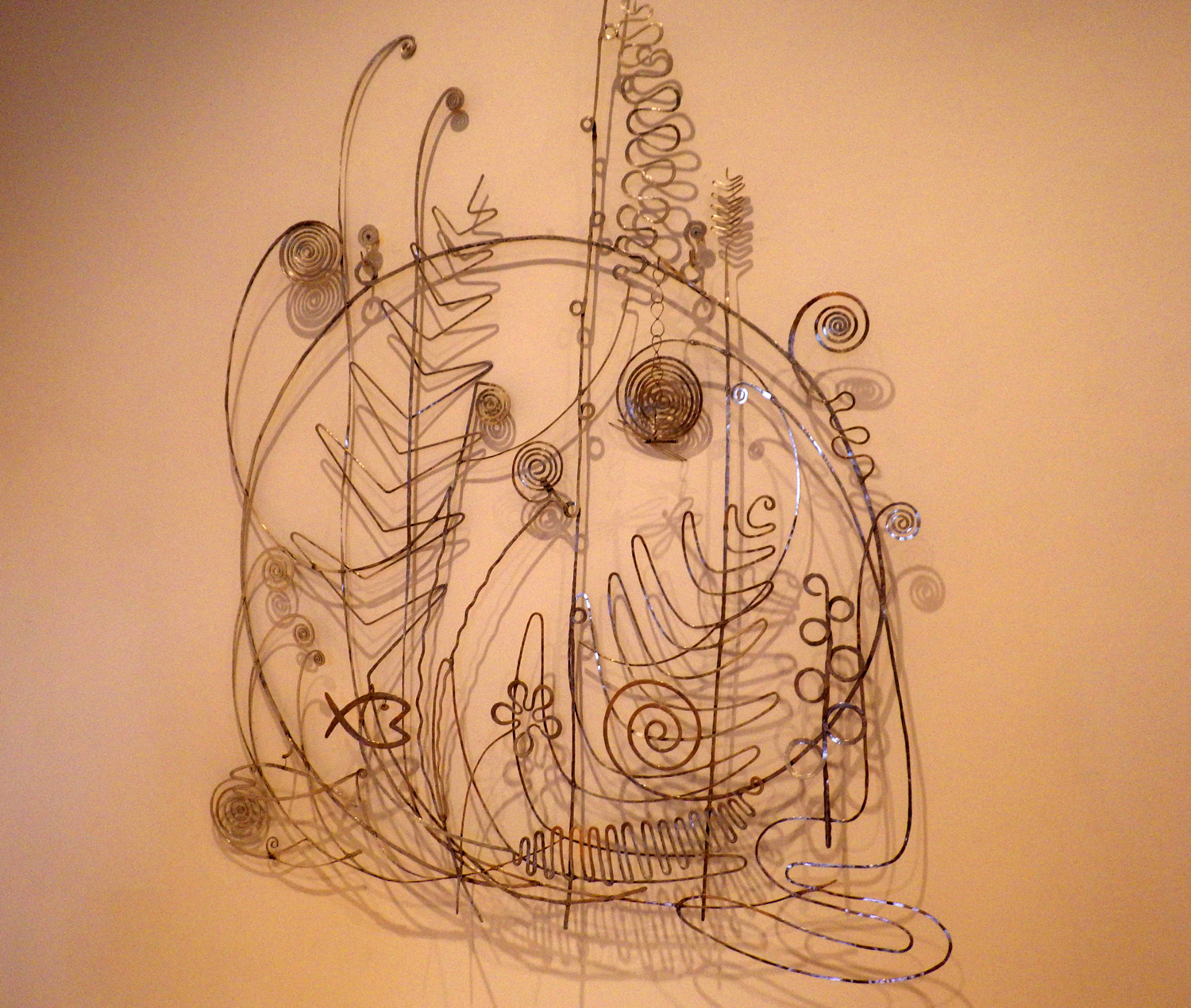
The Italian pavilion was also a group showing, though only of three artists, where the theme of the labyrinth was based on a 1962 essay written by Italo Calvino (The Challenge of the Labyrinth). It was the labyrinth itself - the setting, the meandering from space to space, being confronted with mirrors, lights and curtains - that I found more interesting than any of the work done by the specific artists, which at the time I found chaotic.


Luxembourg's pavilion consisted of Written by Water, a massive installation by Marco Godinho. There was a large quantity of water-damaged books visible on a slope that seemed to continue into the structure of the building with the implication that the amount of books was limitless. Books are a source of information and entertainment, yet the damaged books are silent in their inability to be read. A story is told, nevertheless, and it is the viewer who is challenged to "read" what they will. It is 2019 and there is more here than washed up garbage, but stories - histories, lives - are silenced by poverty, war, death. Personally I felt an overwhelming sadness and regret within the installation, yet a certain rightness to witness being borne.


I had read about the Ghana pavilion before going to Venice, so I was eager to see Ghana Freedom live. This group exhibition takes its title from a song composed for the birth of the new nation in 1957.  I enjoyed meandering through Sir David Adjaye's designed elliptical and earthy galleries, which housed the six artists. The design both allowed for individual exhibitions and unified the work.


While El Anatsui's large-scale works hanging on the pavilion walls may evoke traditional Ghanian decoration, it is their tactility that brings about inspection and discovery. The colourful works are intricate combinations of found materials, such as metal bottle caps and pull tabs from drinking cans, that have a painterly aesthetic.


The pavilion for Saudi Arabia hosted the work of  Zahra Al Ghamdi in a beautiful and peaceful exhibition of light pillars and organic objects. On entering the dim gallery I felt like I was underwater and did a double-take as it seemed opposite to any feelings of "desert" to me. However, I have never been to the desert, so maybe a sea of sand evokes the same feelings as a sea of water, to one who knows it. Al Ghamdi's After Illusion intends to be a "creative dialogue between [the artist] and natural material she associates with her home".


To me, the materials evoked sea life - one could even say the pillars of light were barnacled - but the objects were not specifically recognisable and brought me into the realm of dream.


There were, of course, many more pavilions of interest, but I am not writing that book! I certainly went away from Venice Biennale feeling amazed and privileged to have been able to go there and see such a brilliant array of internation artwork. I look forward to being able to attend another Biennale in the future.

Wednesday 13 November 2019

Venice Biennale - Arsenale curated exhibition

I had bought a 2-day/2 venue ticket in advance of going to Venice, and the first day was spent at the Giardini venue (see here and here for my blog reactions to this!) and the second day was allocated to the Arsenale. As with the Giardini, there was a mix of national pavilions and individual artists as part of Ralph Rugoff's curated exhibition, May You Live in Interesting Times. According to Rugoff's fascinating catalogue essay, the exhibition was divided into two "propositions" - A & B - in the two main venues in order to present different aspects of the artists' work and method of working. Thus, even within two very large group shows (80 artists!) I recognised the names of creators at the Arsenale, whose work I had seen the day before at the Giardini.

Though I did not recall seeing Yin Xiuzhen's work the day before, I was drawn to the huge figure in an airplane crash position. The figure and airplane seat made from dyed clothing was compelling.


One could examine the sculpture from all sides and get a full, claustrophobic sense by entering it from a small opening at the back. The interior was most alarming as sleeves and pant legs from the clothing hung above and around one at a touchable distance. I had the feeling that these clothes were metonymic, representing actual people, possible victims of air incidents. And further, this could be taken to have the larger meaning, which Laurie Anderson expressed in "From the Air" nearly 40 years ago -- "we're all going down together". Certainly Rugoff, and many artists he has chosen to exhibit, express a great concern for the current state of the world.


Wandering into the room housing Shilpa Gupta's installation, For, in your tongue, I cannot fit, I was taken by the crowd of viewers/listeners examining each individual section; I quickly joined them. Above each spiked, text page was a microphone speaker. There was something chilling about the voices, the spiked pages and the overall imagery.


I found out later (I read the didactic before leaving the room) that the pages and the speakers represented the individual voices and words of 100 poets, from the 7th century to the present day, who have been imprisoned for their work or political thought.


Along with Gupta, as an artist whose work resonated with me and stood out in my memory, as I had remembered her work from the Giardini (the destructive gate), I was also delighted to see more work by Christine & Margaret Wertheim.


The craft of their crochet work was given a mathematical/philosophical explanation. Through the use of the old-fashioned teaching tool of chalk and blackboard, one started to have a learning experience (and to me this echoed the work of the likes of German avant-garde artist, philosopher, and political thinker, Joseph Beuys and American poetic physicist, Richard Feynman). The Wertheims are in venerable company with their working methods


and their work. The ropey spiral of crochet reaches up and up, to great heights of contemplation.


While some work seems to reach to the stars, other work has plumbed the depths. Quite literally. And emotionally. And controversially. Christoph Bȕchel's Barca Nostra is the actual migrant ship that sunk in the Mediterranean, after a botched rescue attempt, causing the deaths of possibly over a thousand people who were locked in the hold. The ghost ship is both a monument and memorial to the victims of human trafficking. It is a deadly reminder that in our world there is no freedom of movement for most.


While Barca Nostra most definitely is what it is, Alexandra Bircken's post-apocalyptic installation implies it's appearance: what appears to be hanging bodies or skins of hanging bodies, are latex dippings of cloth. Although the catalogue refers to an upward movement of the figures, their suspension from ladders indicates to me that the movement is downward. Birken's Eskalation provides an image of the end of humanity from a nightmare; Bȕchel's Barca Nostra, perhaps lacking the poetry of  Bircken, provides a fully awake image of the end of humanity.


There was so much amazing work in this exhibition, it is quite impossible to discuss in a short blog. This brief glimpse, however, serves to touch on the tip of iceberg and make one realise that there is much to discover at the Venice Biennale. I, for one, plan to return and see future exhibitions. The Biennale is an amazing showcase where one does not have to travel far to be amazed, exhilarated and challenged by current art and ideas.