Showing posts with label sketches. Show all posts

Wednesday, 5 January 2022

November selfies (2021)

Happy New Year! Before I start with this year, however, I have to catch up on the last couple of months of 2021! As per the past few years, I had a studio residency at Signal Arts Centre for 10 weeks, in Oct, Nov and Dec. One of my self-appointed daily tasks was to do a warm-up self-portrait sketch everyday that I was in the studio. I blogged about the October selfies here. For other information on the residencies for the past few years, a search on this blog for Signal Arts Centre should turn up loads of information and pictures.

This is a soft pencil sketch.


Limiting myself to a few watercolours and one brush, I can work very quickly blocking in an image. I like to put in some drawing over the watercolour to add some definition. In this sketch I used a watercolour pencil for the line work.


I got into the habit of doing a blind contour drawing on Fridays. For this sketch I used a brown felt tip marker. When else will I ever use BROWN!?


I had my folder full of different paper scraps at the studio and some glue, so I decided one day to do a selfie collage.


Back to a limited water colour use but this time using a fine tip black marker pen to do some line work.


Lots to choose from in my cookie tin of materials, so this day I decided on a soft charcoal pencil.


This entire sketch is drawn with watercolour pencils but mostly I used them as dry colouring pencils. I wetted the tip of a purple one to draw in a few defining lines.


Wednesday, 17 November 2021

Signal Arts Centre - October selfies!

Each morning at Signal studio, I start the day with a self-portrait in a dedicated sketchbook. The medium that I decide to use in my sketch entirely depends on my mood that particular day. I enjoy doing this daily exercise as a warm-up and have a variety of media from which to choose. I am surprised that I didn't blog more about my daily self-portraits while at Signal studio in previous years, but I dedicated a post to them in 2017 and two posts in 2020 (here & here). Last week I included a selfie in my post about starting this year's residency, here. For posts about this residency in previous years (since 2017) just do a search for Signal Arts Centre within this blog.

Generally I do a fairly straightforward selfie, but this day I must have felt like the hand was a "sigh" gesture and included it! I think the sketch was done with a 6B pencil.


On this day, I limited myself to three colours from the cake watercolour tray and used a fine black pen for the drawing.


When I do a selfie exercise, I tend not to correct mistakes or labour over the drawing, so what happens happens. In this one, drawn with a soft charcoal pencil, I did not observe the correct distance from my bottom lip and ended up showing myself as having a weaker chin than I do. But really it is a little disconcerting that my staring eyes give me the grim look of Myra Hindley...


I enjoy using watercolour pencils for a sketch, dipping the pencil directly into water, leaving it dry or using a wet brush to spread the colour a bit. 


By limiting my watercolour palette I can block in an image quickly and then define it afterwards with a fine pen.

A soft pencil is always nice to sketch with.


And sometimes using a soft pencil compels me to work a little longer on the sketch. I remember that day I was wearing my NASA t-shirt, so that the end result of me feeling like a crew member of the Enterprise was no suprise. Could I be Captain?


Wednesday, 12 May 2021

old notebook pages

While I was recently sorting through several large correspondence boxes (organising/ culling/ amalgamating) I came across an envelope full of pages from small (only about 5 inches x 3 inches) notebooks I kept in 1981, after I finished art school. I had obviously already culled them at some previous date, only keeping pages that I thought were interesting. I know that these pages came from several different notebooks as there were two back pages in the envelope. One of the back pages, along with doodles, has an advert for a storefront for rent. I never lived in or rented a shop but I must have been thinking of it as an option in my early Toronto days. One of the doodles represents an image of an egg and its shadows that I had previously created as a large silkscreen print in my 2nd year of art school, so obviously the image stayed with me.


I would have had the notebooks in my handbag or pocket with me at all times, and used them constantly, especially if my normal sketchbook was too big to carry around. These are some idea sketches for paintings; my work with flowers was very abstracted at the time.


I actually remember being fascinated by the red ash berries in front of the white brick walls at one section of Ontario Hydro where I was working at the time. I know I did some larger works on paper, based on this image, but they probably were binned at the time of my first great purge in 1988.


I was often doodling this insecure selfie image, which first made an appearance in a sketch I made in NYC on my second visit there, on an art school trip in the spring of 1981.


I also did sketches where ever I was. This is whatever was on the table while waiting to be served in a greasy spoon restaurant.


I imagine I was waiting for someone to get out of the loo, so I just doodled a selfie in a restaurant.


Again the abstract flower motif and a little bit of writing that didn't get obliterated in the initial cull of this notebook.


Thinking of the brick wall and ash motif. The rest of that writing starts on the previous page and refers to a series of nightmares the night before, most especially that there was something wrong with my hands and I was afraid I'd never paint again.


Again, here are some idea sketches for future abstract flower paintings. I remember doing one similar to the top sketch but in a vertical format. Two red "tulips" on a primarily turquoise background, with a pale blue underpainting. 

This is  a series of doodles on top of "requirements" for something -- of what I have no idea! The phrase "2 or 3 essays" is identifiable. I did start York University the following year, but essays were not part of the admittance requirement for the BFA course...


Wednesday, 9 October 2019

Inktober 2019 first time, first week!

The past few years my offspring has been trying to get me to commit to participating in Inktober - where, following prompts, one creates an ink drawing every day in October and posts it on instagram. While I have good reasons not to participate (too busy on other projects!) I decided that this year I would commit to participation. As I have started the residency in the studio at Signal Arts Centre, I have made doing the Inktober sketch part of my daily studio routine: inktober sketch, instagram/facebook post, self-portrait, bookbinding work, printmaking work. The bookbinding and printmaking work at this point is mostly preparation, so the first month of my residency can afford the extra item in my routine.

The prompt for Day 1 was "ring" and I did a fairly quickish sketch of my wedding ring on my hand, using a Staedtler green pen and some yellow ink. The ring was designed and created by an artist friend, after the theft of my original band (which was simple and cheap).


The prompt for Day 3 was "bait" and I simply took off my earrings because they made me think of fishing flies, though if I had have thought about it before I left the house, I may have chosen something more feathery.


The prompt for Day 6 was "husky" and I chose to interpret this as vocal rather than the dog or a person. I thought of the beautiful, sexy, soulful, magnificent voice of Billie Holiday and then thought of her singing the amazing song "Strange Fruit". This song has been covered by many artists but Holiday's is the quintessential version that gives me goosebumps.


My residency morning routine has been (and no doubt will continue to be, for the month of October anyway) to follow the official Inktober prompt and create a sketch accordingly. After I have finished the sketch it is posted to my instagram account, which is linked to my facebook page. The point of the exercise for me is to actually SAY something, tell a story, reveal a thought or memory. This is most obvious perhaps in Day 7 where the prompt was "enchanted". Here is my sketch:


 and this is what I said about it: Day 7. Enchanted. By the cosmos mostly. Natural phenomena. And deep time. In 1981 I was nearly blinded watching 2 suns rise, an atmospheric illusion, above Lake Ontario. In 1990 I picked out Jupiter and 4 of its moons for the first time from a rooftop in Dublin. In the winter of 1992 the Aurora undulated like a huge red curtain over the Ottawa River. From a field outside Port Magee, in Southwest Kerry, in 1995, I saw Comet Hyakutake hanging like a sword in a spectacularly clear, star studded sky.

I am enjoying following this routine and will continue to do it this year. I won't commit to next October till I see what's happening with my other work.

Wednesday, 15 May 2019

Home Project!

A couple of months ago I had a dream in which a friend gifted me some prints. I thought the prints quite beautiful and interesting. Both prints seemed abstract, but on closer inspection I realised they weren't. In the first print, overlapping layers of translucent colour were actually house forms, where each house was a different colour. In the second print, I realised the Rorschach-type blob was actually the same as the first print, except instead of translucent colourful houses, each house was printed opaquely monotone, such that only the outline was identical to the first print. I decided I should do these prints and made a sketch.


In thinking about the new project, I also thought the houses should have personal meaning for me and decided that I would research all the places that I have lived. I have lived in 19 different houses during my life, in Ireland and in Canada, for both short periods (1 month) and long (18 years). With the help of Google maps/streetview I began the research sketches of my homes. The house I lived in for the firt 2 years of my life was in "Cabbagetown" (so named because it was a huge area for Irish immigrants) in Toronto. Despite only being a baby and small toddler in this house, I have a surprising number of memories associated with it. Most significantly is the colour of the door: red.


My family, still remaining in "Cabbagetown", moved to a different house. The house with the green door. My siblings went to the school across the road from this house and "Walter's" was the cornershop up the street. Riverdale Zoo was only a block away, as was a cemetery and a playground park. Again, even though I was very young and only lived there for two years, I have very strong, specific memories associated with this house. While my siblings were at school one day, my Mum was watching a "parade" of some sort on tv. Suddenly I realised she was upset and crying. I was three years old. John F Kennedy was shot.


We moved to The Beach (now called The Beaches) in the east end of Toronto in 1964. I grew up in this house, spending the next 18 years there. I moved out for good the year before my parents fulfilled their constant wish - to retire early and return to Ireland.


I still have two more homes to sketch out of the nineteen, but I wanted to have an idea about colour and translucency. Using tissue paper I sketched the houses and started cutting them out (I have always loved cut-outs!).


 After cutting out the houses, the project started to develop legs. I no longer thought of it as solely a print project, but could imagine other media as well.


Starting at the beginning:
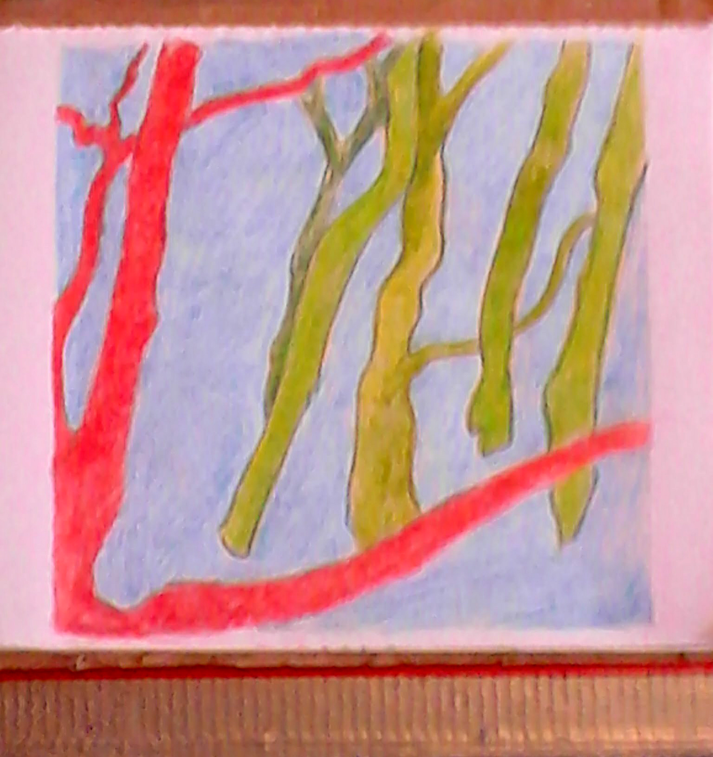
The House with the Red Door, oilstick & graphite on wood, 23.5 cm x 15.5 cm.


Wednesday, 13 February 2019

2019 ceramics workshop - one month in!

Last December I did some sketches of tree and stone imagery that I thought would be nice glaze-painted on tiles. When the ceramics workshop resumed in the new year, I was ready to do four small glaze paintings on ceramic tiles.


 When I was doing the "liminal" sketches of stones on the shore, I made the forms and colouring more complex than the more basic stick images.


With this in mind, I decided to paint the tree tiles first. Even here, I overlapped a few glazes anyway (reds & oranges, blues & greens) to see what would happen.


I was pleased enough with the results. I always lean towards Fauvism when I think of trees and colour at least one of them red.


Glaze painting is always a pleasant surprise as it is impossible to know how the pre-fired glazes will react with each other when fired. There is a certain amount of looseness when painting with glaze on a tile, but its exact colouring can never really be pinpointed.


The trees tiles were put away when I was painting the stones and I decided, in keeping with the sketches, to make the forms more complex. I did take pictures of the tiles before they were fired, but deleted them by mistake. I took especial care over the sand areas, as I did not want them to appear too solid. I glazed first with a bright orange and then, after the orange glaze had dried, took a smaller brush and dotted a bright yellow glaze overtop.


I am very pleased with the colouring and randomness of the glazes.


Wednesday, 7 February 2018

New work // old work

 A few weeks ago a huge, beautiful bouquet of yellow tulips arrived at the door - a cheery post-xmas gift from my husband's uncle in the US.


Anyone who has known me for any length of time knows that yellow tulips are my all-time favourite flower. I have recently been looking through some old sketchbooks for inspiration from my various flower sketches. This crayon and graphite sketch depicts a bouquet in front of one of my abstracted yellow tulip paintings. The sketch is from 1982.


Another sketch from 1982 of the same bouquet in front of another abstracted yellow tulip painting. I remember perfectly well that the dining nook in my apartment in 1982 (in Scarborough, Canada) had three wall spaces, each of which had a large abstracted yellow tulip painting on it! The vase that the tulips are set in is also my work, a ceramic slab wrap-around vase.


It was either in 1981 or 1982 that I began drawing and painting flowers with a vengeance. This particular pastel and graphite sketch is of a bouquet that a friend gave me after my wisdom teeth were removed. One of the four teeth was impacted, so I was laid up for at least a week.


This is a crayon and graphite sketch of a close-up of a really vibrant red tulip from that same period (more than 30 years ago!). The great thing about having all these flower drawings is that they provide references for the glaze paintings I have begun on ceramic tiles. The recent bouquet of tulips arrived in a gorgeous, simple white glazed ceramic vase. I am planning to do a glaze painting on that in the near future.


Wednesday, 31 January 2018

Hand-painted ceramic tiles

Towards the end of last year I came across a box of white ceramic tiles, leftover from tiling the bath/shower area a few years ago. There were 30-40 square tiles in the box, and I wondered if I could make use of them in my weekly ceramics workshop.


First a test tile had to be made so that I could see how the available glazes reacted with the pre-glazed tiles. I was pleased with the result and thought I could proceed with the idea of doing paintings and/or
drawings on the available tiles.


A chart corresponding to the glazes used on the tile test is a necessary and invaluable tool! The available glazes are numbered mostly with Roman numerals, and I left out glazes that I definitely would not be using for this project (e.g., white and clear glazes).


I dug out some of my sketchbooks that had floral drawings and focused on images that I wanted to reproduce on the tiles and re-sketched them to the tile size. I also made a small chart so that the watercolour pencils I was using corresponded with the glaze test tile.


I used this sketch as a model for the finished tile that is the first image above.


I decided to do five testers to see how painting the glazes on tiles would work. It was a meticulous task, as the glazes are being painted on a glossy, smooth pre-glazed tile.


This is an image of four of the completed tiles in the kiln before firing. The fifth tile is on another shelf.


These are the same four tiles, still in the kiln, after the firing. I am pleased with the results and now can confidently do more of these paintings with the other tiles in the box!