Wednesday, 27 March 2019

First shinrinyoku of 2019!

Spring definitely seems to be here! Lately, I have seen so many beautiful trees in full bloom - magnolias, cherry blossom, apple blossom - and the days are getting brighter and longer. Sunday was a perfect day to go for some much-needed shinrinyoku, that is, forest bathing.


Not far from my home is the lovely village of Enniskerry, where one of my favourite outdoor places, Knocksink Woods, is located. It is a wood divided by the Glencullen River's quick flow. This reminds me of Taylor Creek in Toronto (where I grew up); it is the kind of "river" where the bottom can easily be seen and one can get to the other side by getting your feet a little wet or stepping on stones. Knocksink Woods does have several sturdy bridges though, so there is no problem exploring either bank without wet feet. And a game of Pooh Sticks is de rigeur for every bridge.


The sun was shining quite a bit. I didn't bring my sketchbook with me, but I love all the spindly trees.


And spindly branches and gnarly trees.


To my surprise the wild garlic ground cover in shady areas was coming up healthily! Though I didn't expect to see it, I had brought a collecting bag and picked enough leaves to make some wild garlic pesto to go with dinner. There were even flower buds; I will return next week (weather permitting) to do a bigger forage and make batches of pesto for the freezer too. I make wild garlic pesto every year and a full recipe with pictures can be found on a previous post, here.


More tree tangles!


On the glen path back to the road I loved seeing the trees tilt down the slope


with shadows undulating on the uneven ground of the hill.


Wednesday, 13 March 2019

Inspiration from dreams, part 1

I have been transcribing from my dream diaries, most diligently since last June, as it is a necessary thing for me to do - before I am unable to read my own scrawl and also to refresh my memory about images and concepts. I have had a long interest in dreams and dream interpretation (starting with Jung and Freud but also developing personally beyond prescriptive interpretation). Last week at the studio drop-in (Dún Laoghaire Rathdown Arts Office) at The Lexicon in Dún Laoghaire, I decided I would do a left-handed dream drawing of a recent vivid dream. I am right-handed but have found in the past that doing an entire drawing with the left hand gives me enormous freedom.


My fascination with dreams has inspired both my visual work and my writing. Recently I have been included on the Poetry Sound Map reading my poem "Portrait", which was published in New Irish Writing back in 1989. My reading is a recent one, and if writing today, I think that perhaps I would have titled the poem "Self-portrait". It is entirely inspired by and describes my interest in dreams.


I have also recently had a few poems published online in The Scarlet Leaf Review (Jan 2019), two of which reference dreams. In 2016, within my writing, I made a point of familiarising myself with classic forms in poetry, and used the precision of the vilanelle form to write a poem based on a dramatic and vivid dream. The final poem was published in November 2017 in The Examined Life Journal, a vehicle out of the University of Iowa's Carver College. (The poem is impossible to read from the image, so I have transcribed it below.)


A Dream of Dead You

Earth embedded in the fingertips, your dead hands wave
And I notice your shrunken face, your ragged clothes
I will guide you, dead you, sadly but firmly back to your grave

You wanted to remind me of the pleasure you gave
And came back to me, impossibly, from the ground you rose
Earth embedded in ehe fingertips, your dead hands wave

I am glad to see you, cherishing the love we used to crave
But we no longer have that time, your heart no longer glows
I will guide you, dead you, sadly but firmly back to your grave

Your hollow black eyes reflect the darkness of a cave
And funereal depths where not even a cold wind blows
Earth embedded in ehe fingertips, your dead hands wave

From confusion and terrible anguish, you, I cannot save
Lustreless and wretched, a reminder of what my heart knows
I will guide you, dead you, sadly but firmly back to your grave

I have a life that you do not, I beg you to be brave
But your hopeless stance echoes mine and weariness shows
Earth embedded in ehe fingertips, your dead hands wave
I will guide you, dead you, sadly but firmly back to your grave

--------------------------------------------------------------------------------------------------------------------------

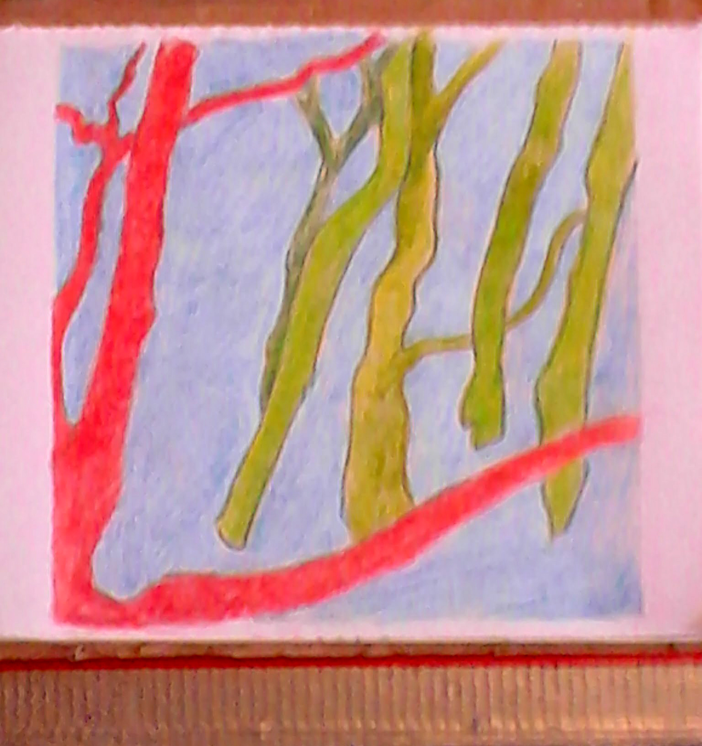
Not all my dreams are about death! This oilstick drawing, based on a dream, I have entitled "Ocean of Life". I am not sure when I did the drawing, as it is unsigned and undated (at least on the front of the drawing, it is hanging, framed in my hallway!). I think it is drawn sometime in the 1980s and I may have had the dream in 1983 when I was living near Lake Ontario in Toronto. At least it was Lake Ontario that featured in the dream. And I remember the figures joyously bouncing in the rough water. I remember at the time I recognised this as a parallel to a previous dream where a school of dolphins were playfully diving in turbulent waters. This, however, is not a left-handed drawing.


In next week's blog, I will continue discussing dreams with more work inspired by dreams.

Tuesday, 12 March 2019

Inspiration from dreams, part 2

This is a very tiny gift sculpture I made for my boyfriend (now my husband) when we were separated by an ocean in 1988. It is based on a sculpture I made in a dream I had around that time. The chairs are moveable. I also think the dream itself was inspired by my mentor at university, sculptor Hugh LeRoy, who I had taken drawing classes with and also asked him to mentor me in independent studies in painting for my final two years in university. Before I had ever met him, I read a review in ArtsCanada about a sculpture he had made featuring an "order" chair and a "chaos" chair. Hugh was also profoundly interested in dream-induced creativity and introduced me to left-handed drawing as a useful method to encourage freedom in drawing.


In 1995 I was living in Kerry and amazed by all the calla lily plants on rural home lawns. But when I dreamed about them they were brightly coloured instead of white. I made a Father's Day card for my Dad that June, with an image of the dream calla lilies. My Dad died a few months later, and I created the piece "Dreaming for Dad" on 2 large net curtains and the companion small icon diptych. When I exhibited them the following year with other works, "Pastures Green", at The Basement Gallery in Dundalk (now called An Táin Arts Centre) I installed them in a separate room so that a life-death passage was clearly represented. I loved the way the lighting reflected muted images of lilies on the walls.


While at a studio residency in the spring of 1989, I enjoyed playing with my dream imagery to create a temporary installation in my studio space at The Tyrone Guthre Centre at Annaghmakerrig. Another painter friend referred to my studio of cut-outs as "The Playroom".


I had been granted the residency to finish work for my first solo show in Dublin, but I only had to complete one large drawing for the exhibition and then I was free to let myself go. I enjoyed drawing images with pastel, cutting them out and affixing them to every wall in the studio.


I know I created this piece sometime after the mid-1980s, based on a dream where I was surrounded by water (but remained dry, kind of like the parting of the red sea in CB DeMille's "Ten Commandments" film) and saw a red-sailed boat in the distance. This is a large (about a metre squared I think) painting/collage on Strathmore watercolour paper - a roll of which was given to me by Hugh LeRoy because he was fed up seeing me disrespect my own work by using newsprint for all my best drawings...I know this work still exists, and is beautifully framed, because it was bought in the '80s by a colleague who is now a very dear friend.


This is another piece, also painted on Strathmore paper (from a huge roll) around the same time as the one above, a variation on the same dream theme. However, I am pretty sure this work no longer exists, other than in my mind.


In my last year of university, 1986, I participated in a group show at the Winters college gallery (at York University in Toronto) and with some other work, presented these large paintings (each panel of the triptych and diptych is 4 ft x 3 ft) based on the red-sailed boat dream theme. Both of these paintings no longer exist, having fallen prey to one of my "Great Purges", a necessity when moving back and forth across continents.


These dream sketches managed to survive, having been recently discovered in my "Grey Box" archive. I know the drawing on the left is created on blotting paper (a nice blurry water effect) and the sketch on the right was created while on holiday in Ireland in 1984, presumably depicting a dream I had during that holiday.


Wednesday, 6 March 2019

ceramic plates

Recently I was reading a coffee-table book on Charleston, home of Vanessa Bell, Duncan Grant, and (at various times) others from the Bloomsbury Group. The book was written by Quentin Bell (Vanessa's son) and Virginia Nicholson. As well giving me yet another peek at life to satisfy my continued curiosity about the group, I was also interested in seeing, within the rooms of the house, pieces of hand-painted pottery on tables, mantles, bookshelves, etc. Quentin Bell was the potter, but often his mother and Duncan Grant would paint the bisque ware before Quentin himself got to it (or he would leave some pots out for them). I liked seeing the pottery as I hadn't quite decided how I was going to glaze the slab plates I have made this year. This platter of mermaids is one of Quentin Bell's pieces.


Over the past dozen or so years, my annual visit to Antibes has also brought me in close contact with the ceramics of Picasso, which I also find inspiring. The Picasso Museum at the Chateau Grimaldi in Antibes has a large selection of his paintings on plates.


I thought some plates made from a low fire white clay would provide a perfect ground for painting.


Since circular slabs were simply draped over pudding bowl lids, I was able to make feet for the plates while the clay was still in its very damp phase.


I decided there was something about terracotta that I really liked and decided on using it for a set of plates. For larger plates I placed the slabs within the curve of a plate as former (cling wrapped first of course!). This meant that I would not be putting feet on the large plates, as the plates needed to dry in their former before I could remove them.


I made some smaller plates in terracotta too. As with the white ones the circular slabs are draped over pudding bowl lids. In this photo I have decided the size and location of the feet and scored accordingly.


This is a foot, made in two pieces, scored and ready to be placed, with plenty of slip, on one of the plates.


Here are the two small terracotta plates with feet attached, signed and ready to dry before bisquing.


Wednesday, 27 February 2019

Quick visit to Belfast

Since a hard border is becoming a real possibility with the impending Brexit, I wanted to make sure I got in a visit to Belfast beforehand, because it is not very likely I will bother returning if there is a guarded border like there was before the Good Friday Agreement.

I love Belfast, especially the multitudinous public sculptures! We were just on an overnight, so after dinner we walked down the street to look at the full moon through Dan George's "The Spirit of Belfast"


Dinner, of course was at Little Wing, which has the best pizza EVER. I think this small chain business only exists in the North, but I wish there was one closer to home. We absolutely love getting the giant pizza with pepperoni on one half, and artichokes, purple onions, tomatoes,and olives ["giardini"] on the other half. Chili flakes, chili oil, and extra parmesan are for the asking. YUM!!!


After breakfast the next morning, We had a pleasant 5 minute walk to The MAC in the Cathedral Quarter of Belfast. This is one of the happiest looking streets I have ever seen. I imagine it must be hopping in the evening.


All the galleries at The MAC were devoted to MAC International, an open biennale with a large prize fund [£20K]. I was surprised that all the work in the exhibition seemed to focus on installation and video/film, with a special interest in the Beuysian concept of lecturing. The work of the prizewinner, Nikolaus Gansterer, was partly created in situ. It seemed to me that one of video lectures included the torture of a group of snails, and I found this quite distressing.


The MAC is a large arts centre, which has a reading area and lots of café space.  Like a ray of light, Mark Garry's "The Permanent Present" (according to The MAC brochure it is also "referred to affectionately" as "the rainbow") is a permanent art piece in the centre.


On the short walk back towards the carpark, I noticed this building but could not really see what was happening with it till I got closer. The wonky reflection in the glass is a much older building across the road. I like it!


I have always liked this sculpture, "The Rise" by Wolfgang Buttress, and finally had my phone camera out in time to take its picture as we were leaving the city under a very dramatic sky.


It rained as we were passing the Mountains of Mourne, but once we got across the soft border, the rain stopped for the rest of the drive home, though the dramatic skies continued.


Wednesday, 20 February 2019

More ceramics - working on the wheel!

With the new year, I decided to try throwing some pots on the wheel. I have certainly been out of practise, not really doing any wheel work for about 30 years! My wrists don't seem to have a lot of strength these days, so centring the clay and coning was more difficult than I remembered.


The two dishes I made, though small, could easily have the function of peanut dishes. While the clay was still very soft after I removed it from the wheel, I re-formed one of the dishes to make it a tad more interesting.


I decided that I would use the same glazing techniques for both dishes. For the inside I painted a solid black glaze that is food-friendly and that I have used before on ceramic pieces (knowing that it fires with a bluish tint). On the outside I used a mix of black and a royal blue glaze that I then sponged off. After this was dry, I painted three different glazes, but only close to the exterior rim as these glazes have a tendency to run when in the kiln. Below are the two dishes after glazing, before firing.


I was very pleased with the results! The exterior glazes did not drip too much, and blended together pleasingly. The interior glaze looks more of a midnight blue than black, and I like it a lot!


I especially like the way the wonky peanut dish fired and look forward to using it the next time I have guests.


Wednesday, 13 February 2019

2019 ceramics workshop - one month in!

Last December I did some sketches of tree and stone imagery that I thought would be nice glaze-painted on tiles. When the ceramics workshop resumed in the new year, I was ready to do four small glaze paintings on ceramic tiles.


 When I was doing the "liminal" sketches of stones on the shore, I made the forms and colouring more complex than the more basic stick images.


With this in mind, I decided to paint the tree tiles first. Even here, I overlapped a few glazes anyway (reds & oranges, blues & greens) to see what would happen.


I was pleased enough with the results. I always lean towards Fauvism when I think of trees and colour at least one of them red.


Glaze painting is always a pleasant surprise as it is impossible to know how the pre-fired glazes will react with each other when fired. There is a certain amount of looseness when painting with glaze on a tile, but its exact colouring can never really be pinpointed.


The trees tiles were put away when I was painting the stones and I decided, in keeping with the sketches, to make the forms more complex. I did take pictures of the tiles before they were fired, but deleted them by mistake. I took especial care over the sand areas, as I did not want them to appear too solid. I glazed first with a bright orange and then, after the orange glaze had dried, took a smaller brush and dotted a bright yellow glaze overtop.


I am very pleased with the colouring and randomness of the glazes.