Wednesday, 29 January 2020

Draped slab ceramic serving dishes

In the late autumn last year I started making some draped slab serving dishes. My intention was to make them quickly and sell them at the xmas craft in December. Of course, things always take a bit longer than I expect, but they worked out fine. I had two formers, one of wood and the other of plaster, bowl-shaped and I overturned them in order to simply drape a slab over them, with a cling-film layer between the clay and the former.


I've been doing a new style of foot lately, in two pieces - two arcs making dishes "float" above a table surface.


I never took photos of how I attached the feet to the 2019 dishes, but I did for recent ones (note the date). After deciding where the clay arcs would be placed and tracing their outlines, the areas would be scored and slipped.


The feet are also scored and slipped, and after affixing to the dish, I lightly paddle them down (with a wooden paddle) in order to ensure that there is no air between the dish and the foot. This is usually apparent when some slip oozes from the joint.


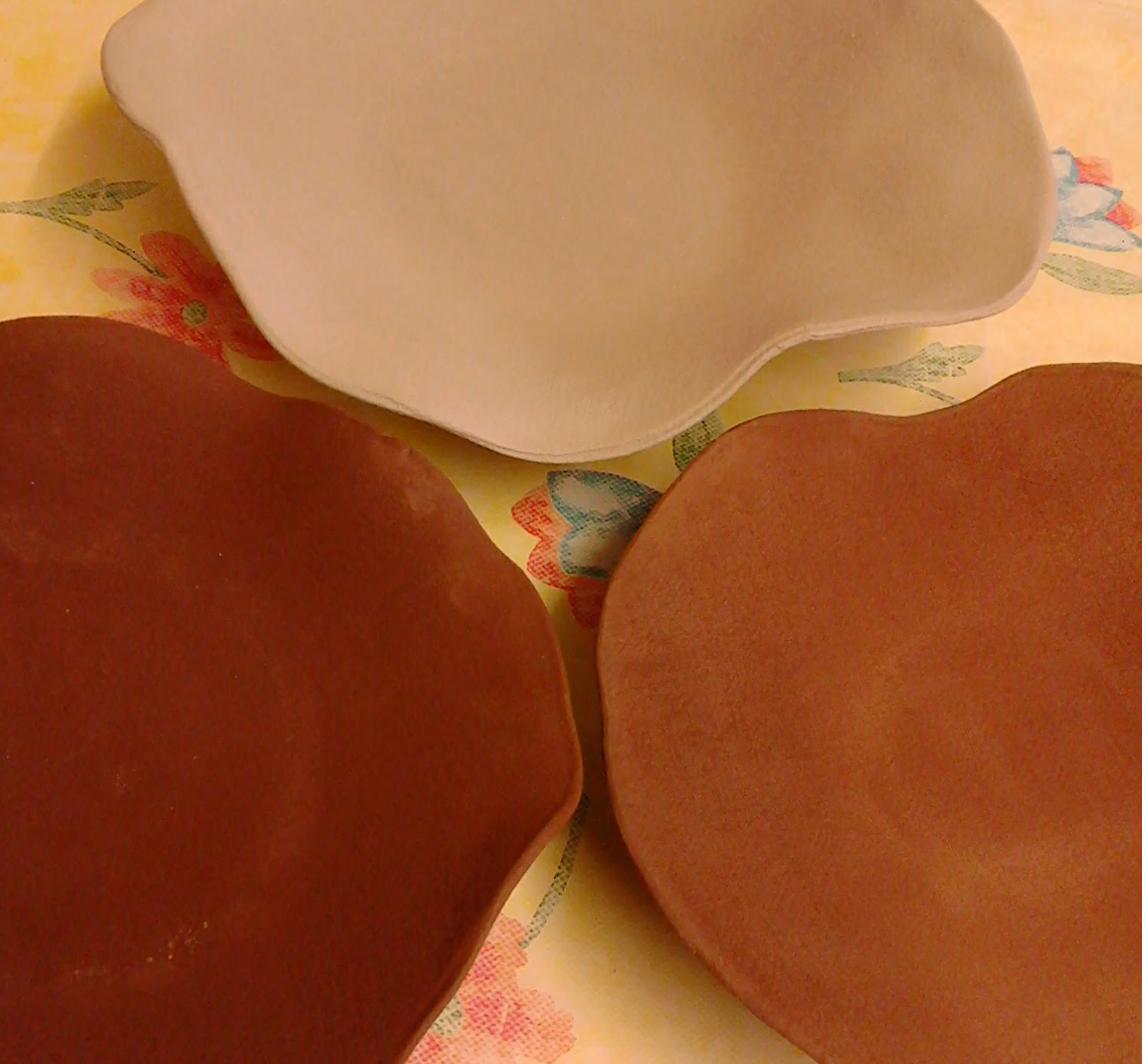
Dried and ready for the first firing, here are two terracotta and one white buff draped slab serving dishes.


After bisque firing the pots are ready to glaze. I decided to glaze the underside of the dishes so the texture when handling wouldn't feel abrasive.


Though this may look like only one glaze, there are actually three different glazes on the terracotta dishes: a base layer of cobalt blue with splashes of two runny glazes (aquamarine and sea green).


I had already witnessed these colours interacting in a lovely way, and was not disappointed.


Both dishes were bought within two days of being for sale, so again I was pleased.


While I made a draped slab dish from white buffclay, I later made two smaller dishes from grey buff. I decided, since I was including them in the xmas fair that I would glaze paint a holly design on them.


I forgot to take pictures of the finished grey dishes before they sold, but they had a white glaze underneath the holly. The white buff dish simply has a clear glaze underneath the holly design. This dish is larger than the grey ones and I'll see it again on my Christmas table setting!


Wednesday, 22 January 2020

Kingswood - large painting

Last spring I started a new body of work based on memories of the homes in which I have lived. I discussed the beginnings of this project here and here. I wrote further about this work in relation to printmaking here and again more about it here. But in the summer I began work on the large painting, Kingswood, representing the house in Toronto where I lived for about 18 formative years. The ground is not canvas, but a type of pressed cloth used for domestic blinds, so there is a type of floral watermark design throughout.


I had a lot of research pix on different flowers (hollyhocks, lilac, apple blossoms, and the tiny white hedge flowers whose name I don't remember) as well as floral sketches, and the main composition sketch that I worked from.


I quickly found out that the ground behaved very differently from ungessoed canvas - REALLY soaking up every drop of paint. I worked loosely and thinned the paint out with water and medium (a mix of matte and gloss).


I had already decided on the 3 figures representing various stages of my life: my very young self on my Communion day (though I neglected to include the bridal veil I wore, I was more interested in the fashionable purple cape made for me by my Mum), my teenage self who spent most summers reading on the front steps of the house. and my young adult self who left home. 


This is a large painting, so it was necessary to use the step ladder to reach areas at the top and I had a cushion to kneel on when working in the bottom areas. The composition sketch was affixed to the wall the whole time I was working.


Any marks made would be visible in the finished painting. This whole painting would also be about process, and I was pleased that nothing would be hidden


There were several lilac trees in the backyard - purple and white lilacs - but my especial interest in the lilac in my painting was the heart-shaped leaves. The crabapple tree bore inedible fruit, but provided great ammunition in our "wars" with neighbourhood friends (a laneway between streets was adjacent to our house, so it was a great fort from which passersby could be pelted),


A plaid shirt and "painter" pants were my favourite clothing articles for a few years in my late teens-early 20s until art school got the better of my fashion sense and long flowy skirts were replaced by punk and neo-punk black.


As planned, I finished and signed the painting by mid-December.

Kingswoodacrylic on pressed cloth, approx 228 cm x 200 cm, 2019


Wednesday, 15 January 2020

Home Project - Memory is My Homeland

Last spring I finalised a title for the body of work, which I had been alternately thinking of as "The Home Project" and "Stories of Home". I finally settled on "Memory is My Homeland", a phrase which I extrapolated from a quote by artist Anselm Kiefer. The beginnings of this work can be seen in previous blog posts here and here. The third small piece in this series is based on the view from my window, from the first time I moved from the family home - I lived here for one month, and almost would not even include it in thinking of my various homes, but for the number of stories that I associate with this one month. I think this work gives an indication of some of these stories!

Dunn Ave, oilstick & graphite on wood, 25.4 cm x 25.4 cm, 2019


In July I did a sketch for a larger work related to the house that I grew up in. I would describe it as being about "growing up, leaving home, and trees & flowers". Kingswood, in the east end of Toronto.


I finished the large painting before the end of 2019, but that will provide a blog post on its own. I used the image from the corner of this painting (a memory of my Communion Day, though for the painting I removed the veil) to feature in some prints.


I previously blogged about going to the Trinity Arts Workshop to learn about carborundum (which can be found here) and it was after printing out the carborundum prints that I decided I wanted to include some linework in the final print. I returned to the TAW to etch a corresponding copper plate and was shown how off-setting a print from the carborundum would facilitate a perfect correspondence. I had never encountered this process before, so it was like magic!


While I was resident at Signal Arts Centre at the end of last year, I did a few more test prints of the carborundum plate. I still have access to a small press and plan to finish the copperplate in drypoint before combining the plates for a final print edition.


I used the Communion image again for a monoprint, but unfortunately I think I applied too much pressure when running through the press, and the ink stuck to and ripped the paper. This is the actual plate before I put it through the press.


Wednesday, 8 January 2020

Handbag book gift

I have made a number of "handbag books" by cutting the leather from my Mum's old handbags, which I received after she died a few years ago. I decided I would make a sketchbook for my child as a xmas present from one of MY old handbags. I chose a black vinyl handbag because of it's size (for a decent sketchbook) and because I thought it would look cool! I also thought it would be great to have a working pocket on the front cover, and there was a zipped pocket on the bag.

Of course once the bag was decided upon, the paper had to be prepared. This simply involves taking measurements and using a metal ruler to tear the paper to size for a deckled effect. Full details on the Japanese stab binding technique can be found here; this is the binding technique I planned to use for this bag. I blogged about the turquoise handbag books that I made from one of my Mum's handbags in 2018 and that can be found here.


Once I had all the paper prepared, including endpapers, I put everything together as a package and marked where the binding holes would be. The holes were made with a drill press - much easier than an awl!


Since my endpapers were yellow, I used yellow cotten embroidery thread for binding.


In order that the pocket was neat on the inside and did not cause any damage to the sketchbook paper or endpapers, I affixed some paper to the inside covers (and weighted down) prior to preparing the final package for binding.


Wednesday, 25 December 2019

Wednesday, 18 December 2019

Signal studio - wind down

My residency at the Signal Arts Centre studio came to an end recently -- don't know if it would have been possible to keep up such a supremely productive pace! I previously blogged about this year's residency here and here. I also had a residency last year, which I blogged about here, here, and here. I am booked in for next Oct, Nov, and Dec too!

In my last few weeks I had borrowed a press and printed up all the lino blocks I had cut. This is a test print, showing also the "window" I made from a heavy cardboard in order that the paper would be lifted off the press base. I adjusted the press roller for the depth of the lino blocks, but the cardboard had the effect of raising the press base such that printing a relief block was not awkward.


I printed all the lino blocks for my intended bound portfolio of prints, "A Short Walk To Fort Carré"


In those last few weeks I also completed a number of blank sketch/notebooks using my modified version of medieval tacket binding. I have blogged about how to do this type of binding here and here.


I also prepared nine pocket size blank sketch/notebooks to include in Signal's annual xmas craft fair. The photo below shows them before using the Japanese stab binding technique. Three have leather covers, three have vinyl covers, and three have acrylic sponge covers. Earlier in the residency I had also made a number of "handbag" books using this binding technique. Several years ago I blogged full instructions to make this type of book, which can be found here.


Once I had all the lino prints done, I wanted to make use of the press during the last couple of days of my residency. I had some oils and one of the carborundum plates I had created during a printmaking workshop I attended in September. I blogged about that workshop here.


As I was cleaning up and clearing out the studio, one of the final "clean" things I wanted to do was cut and create the covers for the series of lino prints I now realised I would not bind until the new year, but I at least wanted to get them made. I always get nervous about measuring and cutting (it's so final!) so I took it pretty slow.


The covers are made of a heavy duty, 100% acid-free blotting paper, and will fold around the print series, bound together using the simple Japanese stab binding technique. The portfolio of prints will be in an edition of three.


On my second last day of the studio, I decided to create a monoprint. Using undiluted alkyd paints on a square acetate plate, I painted the familiar figure. Unfortunately I did not blot my paper dry enough, and it ripped in the press. Rather than daunt me, it just made me realise a few things for next time, as I want to work more with that image.


This is the studio shortly before I moved out: almost everything off the walls, and a lot of work brought home already. On the table near the window, prints are being weighed down to flatten. After a final tidy, I said goodbye to an inspiring workspace and returned the key.


Wednesday, 11 December 2019

Chrismas Craft Fair

The annual Christmas Craft Fair at Signal Arts Centre opened on Mon Dec 10 and will be open 10-5 daily (including Sundays) until xmas eve. The first thing one can't help but notice on entering the gallery is the beautiful aroma of handmade soaps and potpourri.


The galley has been transformed into a lovely craft shop and one is enticed to browse.


There is a great mix of handcrafts - ceramics, cushions, handmade notebooks, xmas decorations, tea cosies, hand decorated t-shirts, felted scarves, stuffed toys, handmade cards - the list goes on!


I contributed a number of things: handmade pocket note/sketchbooks (left), hand-painted tiles (left) and some handbuilt pottery (to the right can be seen two of my shamrock bowls), Also featured on the display steps are my husband's beaten copper tea-light holders (left) and a number of his versatile ceramic teabag/cooking utensil/key holders (centre to lower right).


Here is another view of the display steps.


There are a few more pieces of mine not on the step display - another shamrock bowl (shamrock in flower was embedded to print into the clay before bisquing) and one of my tile paintings.


As well as the terracotta blue-glazed draped vessels (which I don't have a picture of in this blog!) I made a few festive draped-slab serving dishes from grey buff and white clay.


This is a view down the hallway. The display steps are on the first white-clothed table.


This is a view of the corner of the main gallery space. Gorgeous felted scarves are on that clothes rack in the corner and copper jewellery in the centre. Best wishes to all who contributed their work to the fair. There are some real bargins here and the craft work is such a high quality too.