Wednesday 24 November 2021

Mary-Ruth Walsh at Rathfarnham Castle

I wanted to make sure I got to Mary-Ruth Walsh's exhibition at Rathfarnham Castle exhibition, Strangely Familiar Shades of Gray II, before it closed. Especially as I've been seeing information about Walsh's sister exhibition, Skin Deep, which was in Highlanes Gallery,  Drogheda, Limerick City Gallery of Art, and most recently at Wexford Arts Centre.The gorgeous accompanying book of the same name was created through collaboration between Walsh and Folded Leaf (aka Eílís Murphy). In the Entrance Hall there is an overview concept video where Walsh speaks about this body of work (including Skin Deep) and its relation to Eileen Gray's architectural work. Walsh made plaster casts from various packaging materials and then created the haunting cyanotype prints.

Imagine my delight when I saw all the images in cyanotype (my current obsession) in the Salon!


While I know these images are directly related to the plaster casts, they become more like architectural blueprints in both size and quality. The process gives the images a reflective, luminous quality which is ghostly.


This is another view of Salon. There are cyanotype prints on the walls and plaster castings on the pristine, specialty light-box display tables. The entire exhibition makes one extremely aware of light and space - perfect for its setting within the architecture of Rathfarnham Castle.


One cast shared a light table with a clear sphere that reflected the surrounding cyanotypes in miniature.


This is another image of that sphere from a different angle - reflecting the room's windows as well as some of the prints on surrounding walls. In the Pistol Room an ethereal video by Walsh compared Eileen Gray's designed house in France (known as E1027) to the inside of a camera. For me the reflective sphere and this video corresponded through time and space. And light, perhaps.


Although I glimpsed this piece in the Dining Room from the Entrance Hall when I came in, Covid guidelines necessitated following the arrow directions and seeing the work in the Salon first. However, for me, this was a wonderful way to end the show (there was one more cyanotype with matching pink paint on it, but the glass frame made it impossible to photograph adequately). This screen, entitled Aprés Eileen Gray, is a scaled replica of one of Gray's screens. I first came across Gray on an art school trip to NYC, where an exhibition of her designs, including several screens, were on display at The Met. I have been enamoured by her work since, so it was wonderful to see Walsh's homage. I thought this particular piece, which had a strong influence on the design of the book Skin Deep, was in the sister exhibition, so I was excited to see it from the corner of my eye on arrival and then to see it commanding the room at the end of the exhibition.


Wednesday 17 November 2021

Signal Arts Centre - October selfies!

Each morning at Signal studio, I start the day with a self-portrait in a dedicated sketchbook. The medium that I decide to use in my sketch entirely depends on my mood that particular day. I enjoy doing this daily exercise as a warm-up and have a variety of media from which to choose. I am surprised that I didn't blog more about my daily self-portraits while at Signal studio in previous years, but I dedicated a post to them in 2017 and two posts in 2020 (here & here). Last week I included a selfie in my post about starting this year's residency, here. For posts about this residency in previous years (since 2017) just do a search for Signal Arts Centre within this blog.

Generally I do a fairly straightforward selfie, but this day I must have felt like the hand was a "sigh" gesture and included it! I think the sketch was done with a 6B pencil.


On this day, I limited myself to three colours from the cake watercolour tray and used a fine black pen for the drawing.


When I do a selfie exercise, I tend not to correct mistakes or labour over the drawing, so what happens happens. In this one, drawn with a soft charcoal pencil, I did not observe the correct distance from my bottom lip and ended up showing myself as having a weaker chin than I do. But really it is a little disconcerting that my staring eyes give me the grim look of Myra Hindley...


I enjoy using watercolour pencils for a sketch, dipping the pencil directly into water, leaving it dry or using a wet brush to spread the colour a bit. 


By limiting my watercolour palette I can block in an image quickly and then define it afterwards with a fine pen.

A soft pencil is always nice to sketch with.


And sometimes using a soft pencil compels me to work a little longer on the sketch. I remember that day I was wearing my NASA t-shirt, so that the end result of me feeling like a crew member of the Enterprise was no suprise. Could I be Captain?


Wednesday 10 November 2021

Signal Arts Centre - residency early days

As I mentioned in a recent blog, I started my 4th studio residency at Signal Arts Centre a few weeks ago. As in previous years, I set myself the task of having at least three things daily that I was to complete. I really enjoy the warm-up exercise of a self-portrait each day; it is a good drawing exercise and good for exploring different media on the same format. This one is from the first week of the residency; I think it was done with a 6B pencil.


One of my other tasks is to create a number of softbound books for the upcoming annual xmas craft fair at Signal. I picked up a trusty pair of pinking shears to cut the cloth (I have a load of cloth from an upholstery sampler). Part of the the preparation is to match binding threads with the cloth.


Because the awl would be problematic when pushing binding holes in the cloth, I had the idea that a hole punch would work if I could punch holes as I marked them. A few experiments proved that I was not coordinated enough to do this.


So the tried and true way that works (and has worked in the past) is to prep the books for a drill press. Here are a few just waiting for that step before final binding. The third task, and really the main point of my time in the studio this year, is to work on my writing. I spend most of the day on this, but of course I am not taking pictures of the keyboard or computer screen. All is going well!

Wednesday 3 November 2021

Darby's Bridge

 The final painting that I wanted to do for the Memory Is My Homeland series had to do with the first house that I rented (with my then boyfriend, now husband) in Kerry after returning to Ireland in the early 1990s. As I have been creating this body of work for the better part of three years, simply search within this blog to see other paintings, prints and drawings that are part of this series, most of which will be shown next spring at Rathfarnham Castle in an exhibition of that name. Before I had decided on the final title of the series, I was referring to it as The Home Project.

We had ended our European travels in the spring of 1992 in Ireland, and had gone down to Kells Bay in Kerry to visit a Dublin friend who had moved there. On returning to Ireland this friend (easily) convinced us to move to this beautiful village and even found us a place to live, beside this bridge whose name gave itself to the house we lived in, as a postal address.

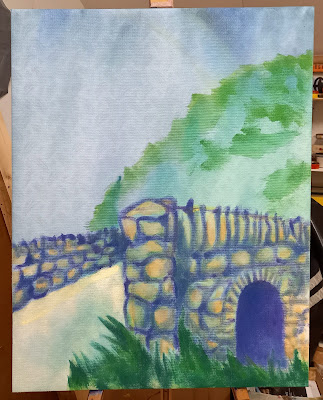
 As with most of my work, I have a very clear idea of what my image will be before I put any media down. The green and blue blurs of paint denote to me the background of sky and hill; I have sketched out the bridge itself with a yellow line. 


Even at an early stage in the painting, I am giving a clear indication of the end product, though there is also always the uncertainty of how paint is going to play out on the pressed cloth. I enjoy this level of unpredictability in my painting, most especially a factor when using a ground that is not canvas.


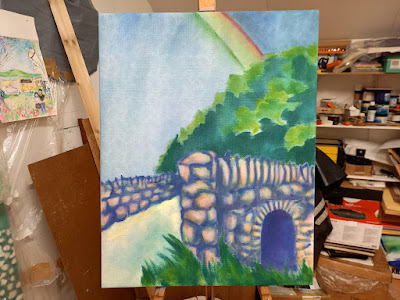
The stone bridge harks back to my series of paintings from the '80s and '90s, My Tower of Strength, which built on my obession with stone ruins of windows. Interested in the architectural structure of a window (usually from monastic sites) I proceed to paint bricks with magical colour - purples, blues, pinks and yellows. I think with the bridge I have been a bit more conservative, but then again...


While I wanted the trees on the background hill to remain elusive, I wanted them also to be a more definitive blur. I have seen some pretty magnificent rainbows in this land and there is something about them that will forever be magical to me, despite their role as a cliché.


Darby's Bridge, acrylic on pressed cloth, 70 cm x 54.5 cm, 2021