I think this might be the last post about the rooftop archive. For my penultimate rooftop archive post visit here and within that post are links to all the previous posts of the archive. Though this sketch is probably from 1991, I forgot to process it and post it in the correct decade of the archive so I decided I would include it in this post anyway! Although it is an undated sketch, I remember creating it in my studio in Toronto before I started the second group of paintings in the My Tower of Strength series. I have long since discarded the rest of the sketchbook (either an A4 or 8.5x11 inch) this sketch manages to survive all my various purges. I used a variety of media to create this sketch – metal leaf, oilstick and some turpentine brushed around some areas of oilstick.
Musings about art, writing, music, travel and food (life, the universe & everything...) by Lorraine Whelan
Showing posts with label tulips. Show all posts
Wednesday, 24 May 2023
rooftop archive 12 - the noughties
I think this painting of the flower lesser celandine is from 2001 (though I'm not entirely sure). It is untitled, acrylic on card, 88 cm x 50 cm.
untitled, acrylic on card, 88 cm x 50 cm
untitled, mixed media on paper, 60 cm x 84 cm, 2000
Labels:
art,
Bray,
contemporary art,
contemporary artist,
drawing,
lesser celandine,
mixed media,
My Tower of Strength,
painting,
physalis,
rooftop archive,
sketch,
studiolife,
Toronto,
tree,
tulips,
works on paper
Wednesday, 11 January 2023
rooftop archive 2
A few months ago I decided to go through a number of portfolios that were in storage on the rooftop section of the attic (the other side of the wall from my studio). I blogged about opening the portfolios and finding things here and wrote about some of the early works here.
Going back a little bit further even, I was pleasantly surprised to see that I had held on to a few prints from CTS art school in Toronto. I think Blue Egg, an undated silkscreen print measuring 70 cm x 59 cm in an edition of 10 (this print is 10/10) is from late 1980 when I was in my third and final year.
Although I did not pursue printmaking again till decades after art school, for awhile I enjoyed making monoprints - simply painting on the back of zinc plates and pressing them to paper with a wooden spoon as I didn't have access to a press. That summer of 1981 I became obsessed with tulips and I remember creating a series of monoprints of them in the basement of my parent’s house in the wee hours of the morning listening to an old record of Cream on a 1970s space-style Panasonic stereo. I loved the song Deserted Cities of the Heart, both the lyrics and Ginger Baker’s drumming. As I used the same zinc plate, the untitled works were all 38 cm x 28 cm. My good friend and cousin was visiting Toronto that summer and I gave her two from this series to take home with her – they are framed and on her wall in London to this day. Only those two, this one and one other from this series still exist.
Wednesday, 12 August 2020
life during lockdown Part 2
Time during this lockdown is totally bizarre! Even things that happened recently seem long, long ago. I am just re-capping here a couple of highlights of May and June, and I feel like I am looking back at years ago. At the beginning of May I was happily working on some oilstick drawings in my studio, as part of the Memory Is My Homeland series and finished this piece, Kingswood Iris. I have previously blogged many times about different pieces for this series, and I have posted those links in last week's blog, which can be found here. I have specifically talked about Kingswood Iris here.
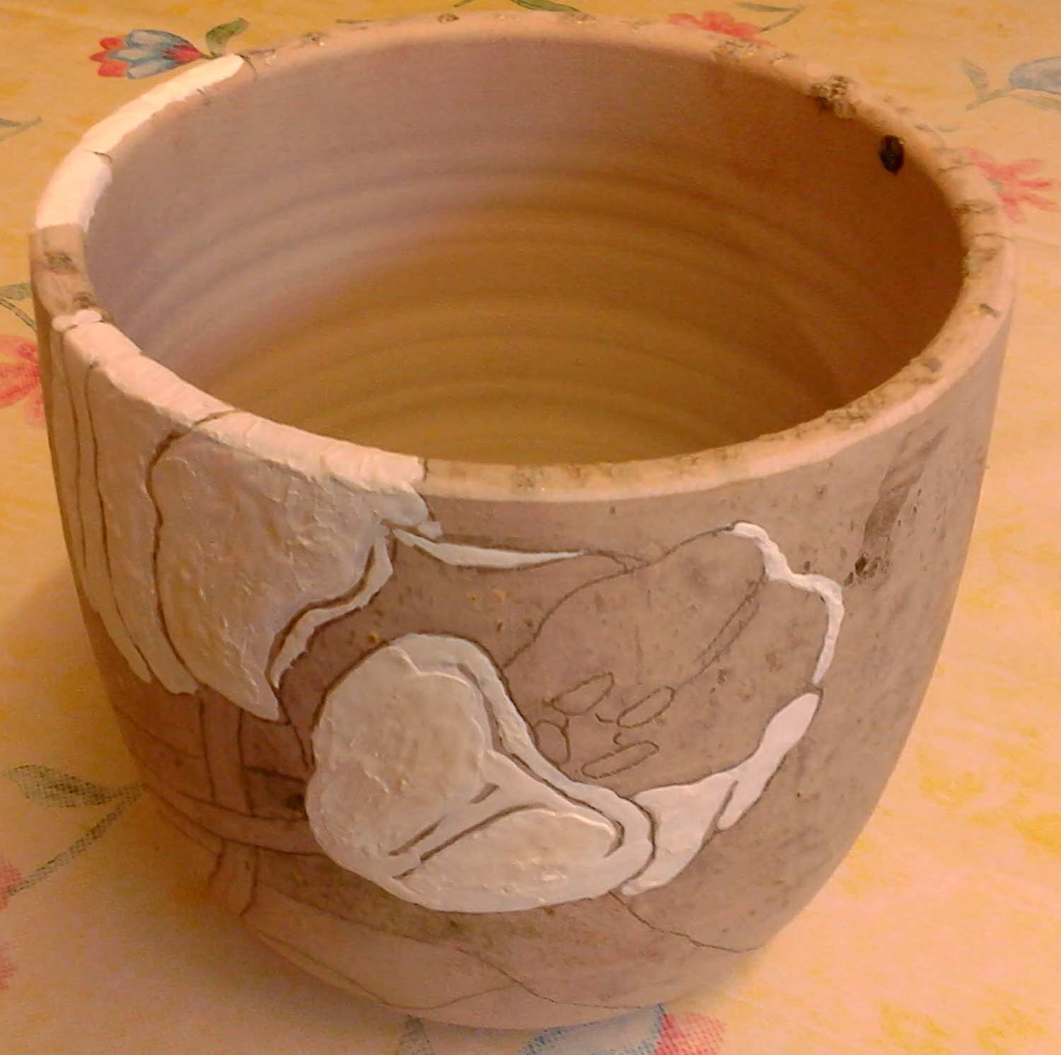
Signal Arts Centre re-opened in June so that staff could prepare for a public re-opening in July. Because of this, a number of firings were put on as there was a plethora of ceramics from the workshops that were waiting patiently since March for something to be done with them. One of the first things of mine that came out of a glaze firing, was the large glaze-painted tulip vase. Three years ago, I had meticulously painted a tulip design on a vase but the results were disastrous as what I thought was a white glaze was, in fact, a glossy white paint! The results sat idle for a number of years until I decided to revisit the vase in the New Year. I blogged about the process of reclaiming this vase here, including giving links to the initial work and failure.
In the latter half of June, I took a 2-part silk fibre paper-making workshop via zoom. I was completely unaware of this process for paper-making but loved it and could immediately see the possibilities for my future artmaking! I blogged in more detail about this workshop here.
In addition to my tulip vase (above), I also had a number of draped slab dishes come out of the kiln in June. I had glazed several of them with a crackle white glaze, the crackle in this glaze only becoming apparent after India ink is applied and rubbed off. I blogged about this process here.
Also in June, I took part in the "Grasp the Arts" campaign. The point of the campaign, for me, was to highlight the role of artists in society's general mental well-being. Many art practitioners, in the widest sense, have lost work and opportunities during the lockdown. An under-acknowledged field of work, the arts are the mainstay of civilisation and survival and it is during lockdown that people have turned to the arts for entertainment - through binge-watching tv shows, streamed music, fb & instagram music & poetry gigs, theatre, opera, literature, etc - to mentally survive this crisis. I discuss this campaign further here.
Wednesday, 15 July 2020
tulip vase
As I realised my time at the ceramics workshops at Signal Arts Centre was coming to an end (I have many other projects that are now taking priority attention, although I foresee returning to ceramics sometime in the future), there was still the matter of the disastrous vase I glaze-painted three years ago. I described full details of this spectacular failure here. However, the vase was sanded and scoured and sitting in a corner periodically beckoning to me. Luckily I actually did return to it in February and worked on re-glazepainting before lockdown.
I still wanted to glaze the vase using the original tulip design, and I still have that design as I had been using it as reference for the tulip patterns on my terracotta dinnerware set (I blogged about the bowls here, and that post contains all the links to other parts of the set). I simply applied graphite to the reverse side of the design and traced the floral outlines,
transferring the pattern to the vase.
Then I began, colour by colour, to paint in the design with glaze.
As can be seen here, it wasn't possible to remove all the debris from the initial disaster, so I resolved to simply take the chance on re-glazing and see if these blemishes added an interesting effect to the final vase.
The underlying vase is a pale colour but I decided NOT to glaze paint any outlines on the design this time round. Though the lines between colours appear quite strong in this picture, I expected that it would be more subtle in the firing.
After the disaster of three years ago, I liked the look of the melted blue glass so did not have it removed with the other detritus. I hoped the second attempt at firing the vase would not be unkind to this effect.
I was pleased with the final results.
Signs of the first firing are random and not particularly intrusive (for instance the interior spot visible on the right side in this picture) .
Another view of the fired vase.
This view shows that the stained glass was happy enough with the second firing, showing off it's mix of several colours of blue.
I still wanted to glaze the vase using the original tulip design, and I still have that design as I had been using it as reference for the tulip patterns on my terracotta dinnerware set (I blogged about the bowls here, and that post contains all the links to other parts of the set). I simply applied graphite to the reverse side of the design and traced the floral outlines,
transferring the pattern to the vase.
Then I began, colour by colour, to paint in the design with glaze.
As can be seen here, it wasn't possible to remove all the debris from the initial disaster, so I resolved to simply take the chance on re-glazing and see if these blemishes added an interesting effect to the final vase.
The underlying vase is a pale colour but I decided NOT to glaze paint any outlines on the design this time round. Though the lines between colours appear quite strong in this picture, I expected that it would be more subtle in the firing.
After the disaster of three years ago, I liked the look of the melted blue glass so did not have it removed with the other detritus. I hoped the second attempt at firing the vase would not be unkind to this effect.
I was pleased with the final results.
Signs of the first firing are random and not particularly intrusive (for instance the interior spot visible on the right side in this picture) .
Another view of the fired vase.
This view shows that the stained glass was happy enough with the second firing, showing off it's mix of several colours of blue.
Wednesday, 11 September 2019
Tulip bowls
In previous blogs I have described the making of bowls and plates through handbuilding, rather than throwing on the wheel. One of my main projects this year, in the ceramics workshop, is to create a dinnerware set. Details of the large and small plates of the dinnerware set can be found here, here, here, and here. Here are two of the bowls for the set after I put the feet on them, using two thin semi-circular slabs.
When the four bowls (it is a quartet tableware set) came out of the bisque fire, I drew the tulip designs directly on them with a pencil. I talk about the bowls and my plans for glazing here.
I started with glaze painting the flowers - two different colours of yellow.
I glaze painted the leaves and stems with "tropic green" a speckly green that I particularly like, but I painted a coat of "apple green" over the stems as I wanted them to vary from the leaves, but still have that nice speckle.
Since a glaze fire was announced, I worked at getting one bowl completely glazed. The background and inside of the bowl are glazed with the same "speckled turquoise" that are on the plates.
I was very happy with the firing results of the bowl! I found out that the tropic green is one of the runnier glazes and really liked that gravity pulled it down a bit to accentuate the terracotta lines. I also enjoy the random dripping into the stem from the leaves.
Here is another view of the first finished tulip bowl. The "speckled turquoise" is a consistently beautiful colour and the interior of the bowl is very smooth.
Another view of the finished bowl! Once I finish glazing the other three bowls, I will start work on 4 mugs to complete the dinnerware set.
When the four bowls (it is a quartet tableware set) came out of the bisque fire, I drew the tulip designs directly on them with a pencil. I talk about the bowls and my plans for glazing here.
I started with glaze painting the flowers - two different colours of yellow.
I glaze painted the leaves and stems with "tropic green" a speckly green that I particularly like, but I painted a coat of "apple green" over the stems as I wanted them to vary from the leaves, but still have that nice speckle.
Since a glaze fire was announced, I worked at getting one bowl completely glazed. The background and inside of the bowl are glazed with the same "speckled turquoise" that are on the plates.
I was very happy with the firing results of the bowl! I found out that the tropic green is one of the runnier glazes and really liked that gravity pulled it down a bit to accentuate the terracotta lines. I also enjoy the random dripping into the stem from the leaves.
Here is another view of the first finished tulip bowl. The "speckled turquoise" is a consistently beautiful colour and the interior of the bowl is very smooth.
Another view of the finished bowl! Once I finish glazing the other three bowls, I will start work on 4 mugs to complete the dinnerware set.
Wednesday, 19 June 2019
ceramic handbuilt bowls
I made four bowls to go with my tulip dinnerware set, which can be seen in progress and finished here, here, here and here. A medium-size pudding bowl was used as a former (lined with cling film of course!).
You can see the feet on the bowls are made by two half-moon, measured slab pieces similar to the feet on the small plates in the set. They were affixed when the bowls were leather hard, in the usual manner of scoring and slipping.
I drew tulip designs on each bowl's exterior. I think the interiors will be the solid speckled turquoise glaze that I used for the background on the plates (so they will also connect with the backgrounds on the bowl exteriors). The speckled turquoise glaze has a bit of a rough texture, though, so I will also do a top coat of clear glaze to hopefully smooth it out.
A glaze firing was going to be put on, so I shelved these bowls, knowing that the glaze-painting of the designs would take a bit more time than I had. I quickly glazed a smaller, simpler bowl so it would go in that firing.
You can see the feet on the bowls are made by two half-moon, measured slab pieces similar to the feet on the small plates in the set. They were affixed when the bowls were leather hard, in the usual manner of scoring and slipping.
I drew tulip designs on each bowl's exterior. I think the interiors will be the solid speckled turquoise glaze that I used for the background on the plates (so they will also connect with the backgrounds on the bowl exteriors). The speckled turquoise glaze has a bit of a rough texture, though, so I will also do a top coat of clear glaze to hopefully smooth it out.
A glaze firing was going to be put on, so I shelved these bowls, knowing that the glaze-painting of the designs would take a bit more time than I had. I quickly glazed a smaller, simpler bowl so it would go in that firing.
This turned out to be a good plan! Using only two glazes - fire engine red for the interior and rose gold for the exterior - my small terracotta bowl turned out quite lovely. I call it Libation Bowl. Though I am sure this is suitable for blood sacrifices, it will probably get most use as a peanut bowl.
Wednesday, 8 May 2019
Handbuilt tableware set, ps - part 4 of 3...
This is the last of the four large terracotta plates for the tableware set, it didn't make it into the previous glaze firing. One thing I realised when the others came out was that I had to apply a clear glaze on the lines between colours. The raw terracotta lines looked great but would not be useful if I was going to use the plates for dinnerware, which I am! So with the already fired plates, I just had to apply some clear glaze and re-fire. With this plate I could apply the clear glaze before going into the kiln, thereby doing the glazing in one step (as it should be).
Wednesday, 1 May 2019
Handbuiilt tableware set, part 3 of 3
I was delighted when the first five plates came out of the glaze fire.
The colours of the glazes were as I had hoped and planned. The lighting with my husband's camera is very true (he is the workshop facilitator and always takes pictures of each kiln shelf as he unloads a firing).
Though there is a yellow tinge to pictures taken with my camera phone, the closeups show the linework
and glaze textures on the plates.
These closeups also show the individual designs of each plate and the different lighting
makes it apparent that there is also a texture on the plates, from the initial rolling of the terracotta.
The clay was rolled out between two cotton cloths with a herringbone pattern, and though this is subtle, it is quite lovely.
Subscribe to:
Posts (Atom)